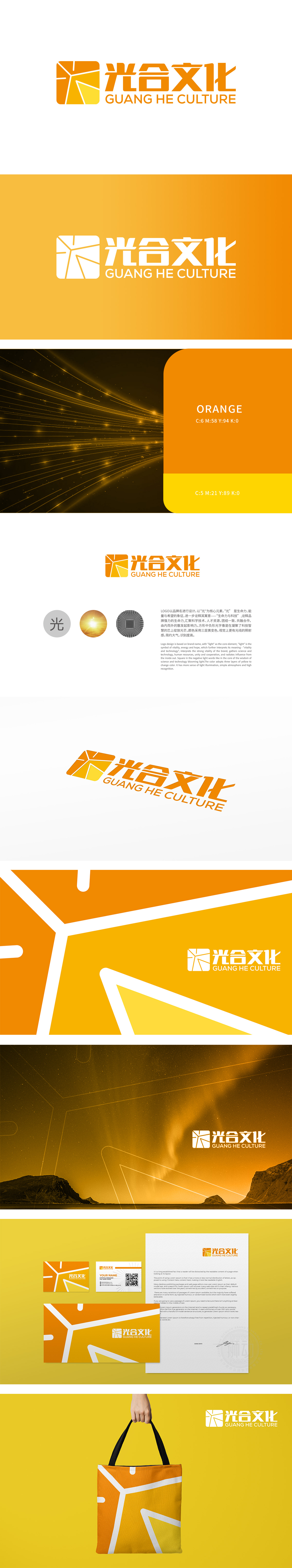
狮动设计将品牌名“光合”为核心,提炼“光”作为超级符号,实现了“科学内核+文化外延”的双重表达:通过放射状线条分割形成“光芒迸发”的负空间,既模拟了光合作用中能量转化的动态感(象征文化价值的生成与传递),采用三层渐变金黄(从浅黄到深橙),不仅通过色彩明度差模拟光线照射的纵深感,更借由黄色的文化联想(东方语境中象征尊贵、活力,西方语境中代表希望、温暖),构建跨文化的视觉亲和力,为品牌后续文化传播奠定包容性基调。将文化传播比作“光合作用”——吸收(汇聚人才、科技)、转化(创新内容生产)、输出(辐射影响力),赋予品牌可持续发展的文化内涵。
Lion Design takes the brand name "Photosynthesis" as the core, and refines "Light" as the super symbol, realizing the dual expression of "scientific core+cultural extension": the negative space of "generate of light" is formed through the division of radial lines, which not only simulates the dynamic sense of energy transformation in photosynthesis (symbolizing the generation and transmission of cultural value), but also adopts three layers of gradual golden yellow (from light yellow to deep orange), not only through the simulation of color brightness difference. , the yellow cultural association (symbolizing dignity and vitality in the eastern context and hope and warmth in the western context).
、


扫码或拨打添加客服微信


