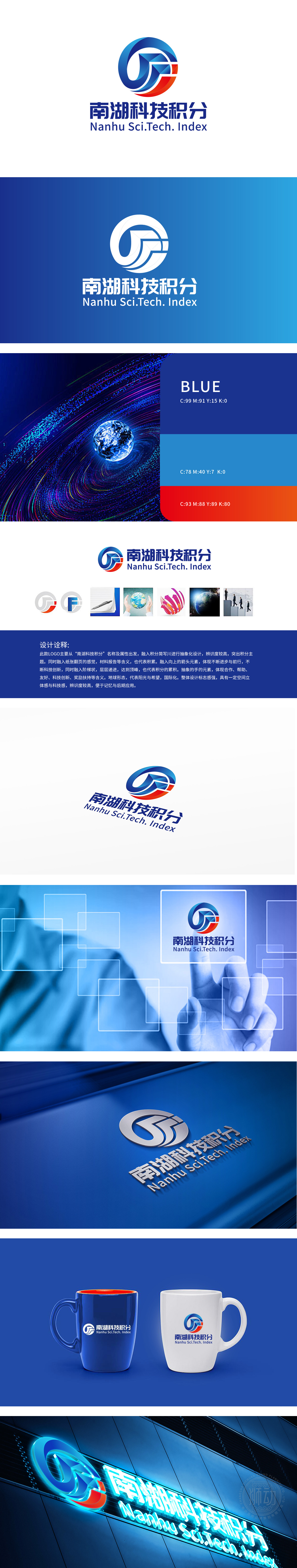
狮动设计以暗藏的“纸张翻页”弧度(转化为扁平化几何切面,既保留“积累”的原始含义(如文件、数据的堆叠),又通过锐利线条削弱纸质媒介的厚重感,体现“科技积分”的数字化、轻量化特性。蓝色圆弧象征科技领域的包容性与全球化视野(呼应地球元素),红色斜线则强化向上的趋势感,二者交织形成“流动的数据循环”意象,暗合科技积分的“累积-增值”逻辑,突破传统金融符号的静态感,赋予科技动态属性。狮动设计通过“抽象符号+科技配色+动态趋势”**的三重手法,将“南湖科技积分”的金融属性与科技基因深度融合:既以“积分”为锚点确保主题明确,又通过几何化、数字化的视觉语言拓宽了“科技赋能全球、协作创造价值”的品牌想象空间。
Lion Design not only retains the original meaning of "accumulation" (such as the stacking of documents and data), but also weakens the heavy feeling of paper media through sharp lines, which embodies the digitalization and lightweight characteristics of "scientific and technological integration". The blue arc symbolizes the inclusive and global vision in the field of science and technology (echoing the elements of the earth), while the red diagonal line strengthens the sense of upward trend. The two interweave to form the image of "flowing data cycle", which coincides with the logic of "accumulation-appreciation" of science and technology integral, breaks through the static sense of traditional financial symbols and endows science and technology with dynamic attributes.


扫码或拨打添加客服微信


