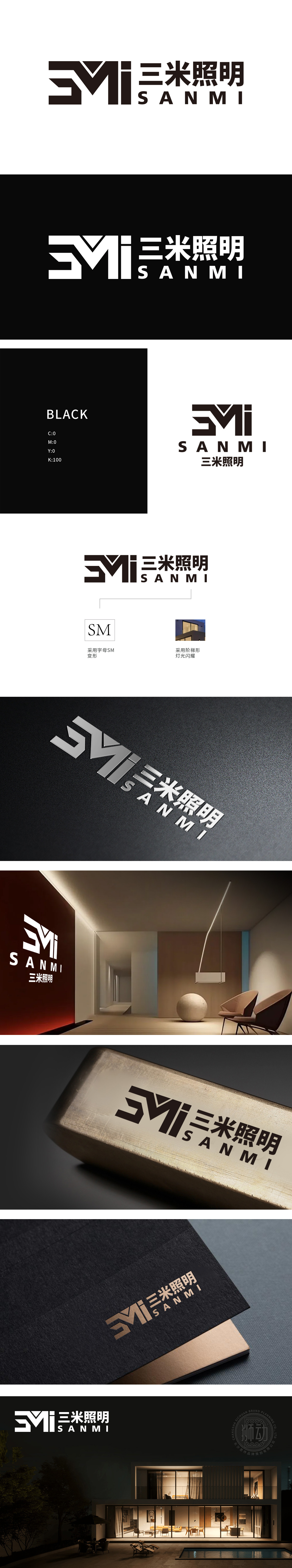
狮动设计通过以“光”为核,构建品牌基因,“SM”字母变形:抽象化的“光与结构”,LOGO核心图形由“SM”(SANMI首字母)变形而来,左侧“3”与右侧“M”“i”融合,形成连贯的视觉符号,三角形缺口设计巧妙隐喻“光束的穿透性”,如同灯光从灯具中射出的瞬间,强化“照明”的功能属性;整体图形以“SM”字母为骨,通过折线切割、三角缺口、阶梯结构,将“电流的流动”“光束的穿透”“灯光在建筑上的折射”三大照明核心场景,压缩成一个可被瞬间感知的视觉符号,让抽象的“光”有了可触摸的形态,让行业属性从“功能”升维为“美学符号”。
Lion design constructs brand genes by taking light as the core, and the letter SM is transformed into abstract light and structure. The core graphic of LOGO is transformed from SM (the initials of Sanmi), and the left "3" and the right "M" and "I" are fused to form a coherent visual symbol. The triangular notch design subtly metaphor "the penetration of light beam", just like lighting. The whole figure takes the letter SM as the bone, and through the zigzag lines, triangular notches and ladder structure, the three lighting core scenes of current flow, light beam penetration and light refraction in the building are compressed into a visual symbol that can be perceived instantly, so that the abstract light has a tangible form and the industry attribute is upgraded from "function" to "aesthetic symbol".


扫码或拨打添加客服微信


