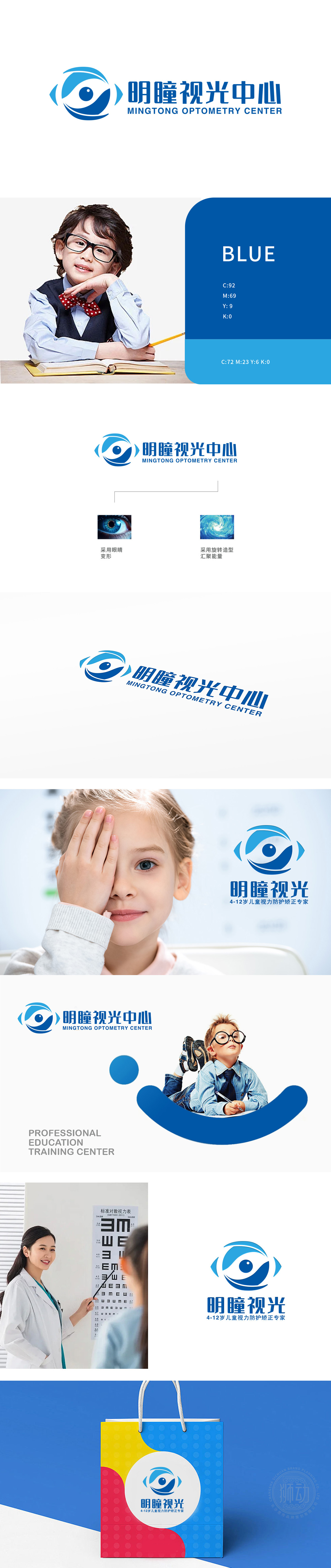
狮动设计以“眼睛”为核心识别符号,通过抽象变形与动态元素结合,直观传递“视光医疗”的行业属性,同时赋予品牌专业、科技与生命力的视觉联想,外轮廓采用对称的弧形线条,内侧以圆形瞳孔为中心,搭配向外延伸的蓝色渐变环,既保留眼睛的辨识度,强化“眼部健康”的医疗服务场景联想,让消费者快速关联“视力检测、矫正、护眼”等核心业务,降低认知成本。Logo成为连接“医疗专业性”与“眼睛保健情感价值”的桥梁——既是视光中心的“视觉名片”,更是用户心中“值得信赖的护眼伙伴”。
Lion design takes "eyes" as the core identification symbol, and through the combination of abstract deformation and dynamic elements, it intuitively conveys the industrial attributes of "optometry medical care", and at the same time endows the brand with visual association of professionalism, technology and vitality. The outer contour adopts symmetrical arc lines, the inner side is centered on the circular pupil, and the blue gradient ring extends outward, which not only retains the eye recognition, but also strengthens the association of "eye health" medical service scenes.


扫码或拨打添加客服微信


