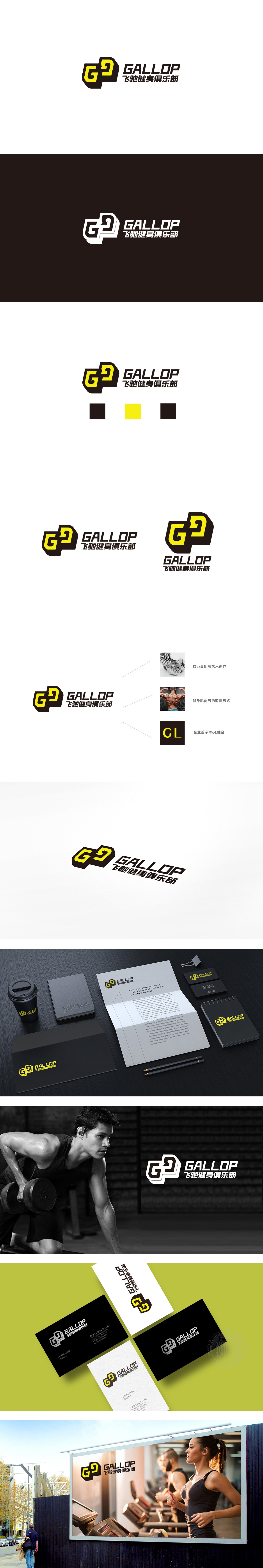
狮动设计采用主图形是字母“G”与“P”(隐含“Power/力量”)的创意融合,但更妙的是加入了循环箭头元素——箭头沿着“G”与“P”的轮廓流动,形成一个闭合的“运动环”。箭头的“循环感”直接暗示健身的核心逻辑:坚持与重复(运动是一场“持续的循环升级”);流动的线条模拟了“奔跑、跳跃”的动态,像一个正在发力的运动员,瞬间唤醒“运动的本能”;整体用“符号化的图形、有逻辑的色彩、统一的风格”,用最直接的方式传递给用户。传递“健身=活力+坚持+专业”的品牌内核。
Lion design adopts the creative fusion of letters "G" and "P" (implying "Power/ strength"), but it is even better to add a circular arrow element-the arrow flows along the contours of "G" and "P" to form a closed "motion ring". The "sense of circulation" of the arrow directly implies the core logic of fitness: persistence and repetition (exercise is a "continuous cycle upgrade"); Flowing lines simulate the dynamics of "running and jumping", like an athlete who is exerting strength, instantly awakening "the instinct of movement".


扫码或拨打添加客服微信


