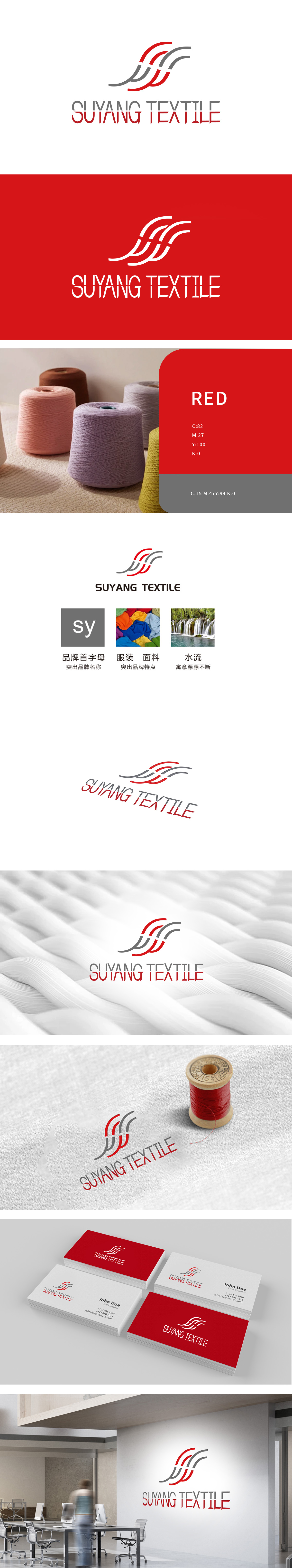
狮动设计由红、灰两色流畅曲线构成,形似奔涌的水流,既呼应了“水流寓意源源不断”的品牌生命力,又暗合纺织行业中面料的柔软垂坠感与丝线的流动特性。红色线条象征活力与创新,灰色线条体现专业与稳重,色彩对比既增强视觉记忆点,又传递出品牌在传统纺织工艺中注入现代设计的理念。形成“以首字母为骨架、以行业属性为血肉”的设计逻辑,用“水流穿针”重构纺织品牌视觉基因。
Lion design is composed of smooth curves of red and gray, which looks like rushing water. It not only echoes the brand vitality of "continuous water flow", but also coincides with the soft drape of fabrics and the flowing characteristics of silk thread in textile industry. Red lines symbolize vitality and innovation, gray lines reflect professionalism and steadiness, and color contrast not only enhances visual memory.


扫码或拨打添加客服微信


