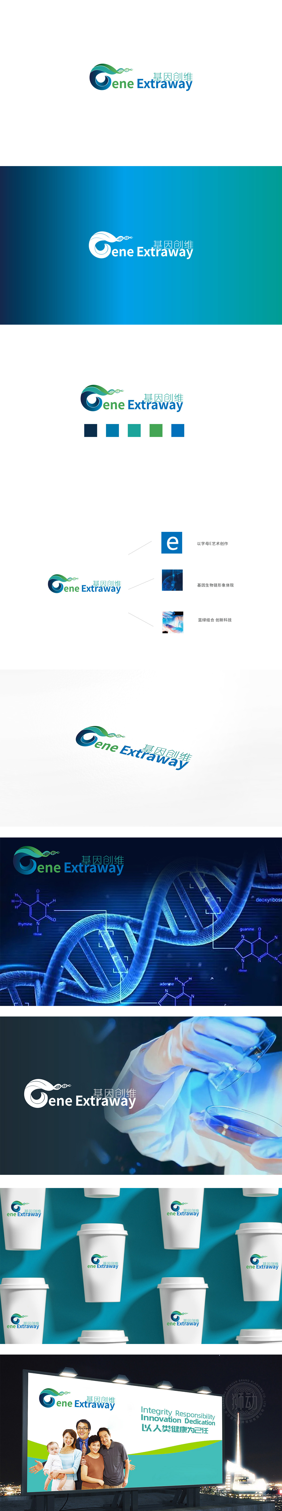
狮动设计采用字母G(基因)的变形,既保留了品牌首字母的记忆点,又通过流动的形态模拟了生命的动态感。DNA双螺旋:直接戳中基因医疗的核心符号,瞬间让用户联想到“基因检测、生物科技、精准医疗”等行业关键词。蓝绿渐变配色:蓝色是医疗行业的“信任色”(代表专业、可靠、科技),绿色是“生命色”(代表健康、活力、治愈),两者结合刚好传递了“科技赋能健康”的医疗服务理念。整体形态的“轻盈感”:波浪形的曲线,反而像“生命的涟漪”,这种视觉感受符合医疗服务的“人文属性”——让人联想到“关怀、舒适、希望。
Lion design adopts the deformation of the letter G (gene), which not only retains the memory point of the brand initials, but also simulates the dynamic sense of life through the flowing form. DNA double helix: directly poking the core symbol of gene medical treatment, instantly reminds users of industry keywords such as "gene detection, biotechnology, precision medical treatment". Gradual color matching of blue and green: blue is the "trust color" (representing professionalism, reliability and technology) and green is the "life color" (representing health, vitality and cure) in the medical industry. The combination of the two just conveys the medical service concept of "technology empowers health".


扫码或拨打添加客服微信


