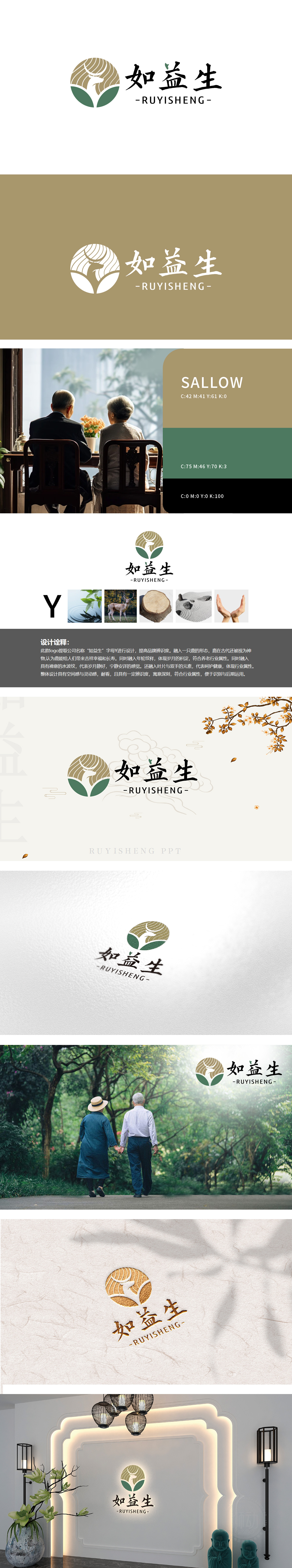
狮动设计采用品牌名称“如益生”首字母“Y”为视觉骨架,线条流畅且具有向上延伸感,既强化品牌名称的记忆点,又暗合“生长、滋养”的生命力意象,与保健品“赋能健康”的核心价值呼应。主体融入鹿的侧影轮廓:鹿首微扬,鹿角以弧形线条简化呈现,身体与“Y”的右半部分自然衔接。鹿在传统文化中是祥瑞、长寿、健康的象征,契合保健品对“滋养生命、延年益寿”的品类联想,同时传递“自然馈赠”的纯净感。背景以同心圆年轮为底,象征“岁月积淀”与“自然本真”,呼应中式养生“顺应天时、厚积薄发”的理念,也暗示品牌对品质的长期坚守。通过极简线条与东方色彩,整体传递“天人合一”的养生智慧,构建了“传统祥瑞+现代健康”的双重意象。既彰显了保健品“天然、滋养、守护”的行业属性,又以高辨识度的视觉语言传递出“中式养生”的文化底蕴。
Lion design takes the initial "Y" of the brand name "Ruyisheng" as the visual skeleton, with smooth lines and upward extension, which not only strengthens the memory point of the brand name, but also coincides with the vitality image of "growth and nourishment", echoing the core value of health care products "empowering health". The main body blends into the silhouette of the deer: the deer head is slightly raised, the antlers are simplified in arc lines, and the body naturally connects with the right half of the "Y". Deer is a symbol of auspiciousness, longevity and health in traditional culture, which accords with the category association of health care products to "nourish life and prolong life" and conveys the purity of "natural gift".The background is based on concentric rings, symbolizing "the accumulation of years" and "the truth of nature", echoing the concept of "adapting to the weather.


扫码或拨打添加客服微信


