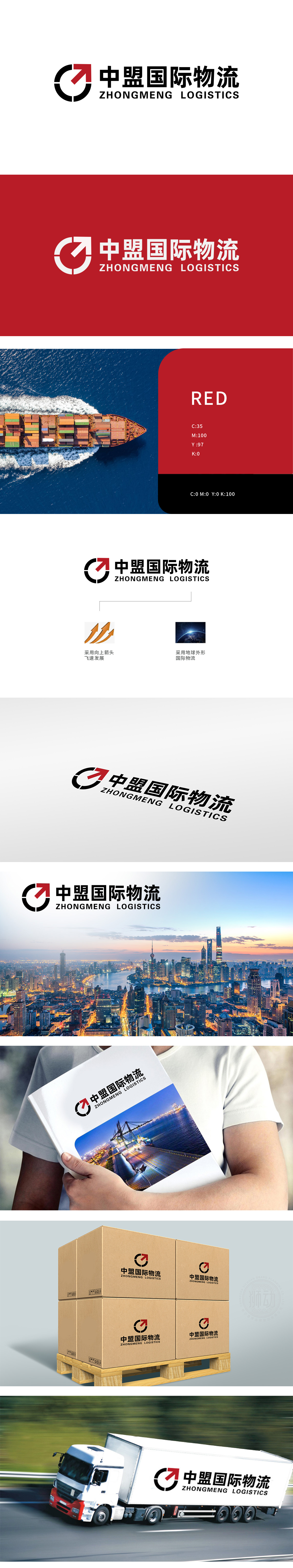
狮动设计以环形与箭头组合,象征物流运输的“闭环链路”与“全球化网络”,环形的完整性传递“高效、可靠、无间断”的服务承诺,同时暗合“中盟”中“盟”字所蕴含的“联盟、合作、连接”之意,体现企业整合全球资源的能力。箭头呈顺时针向上趋势,兼具“速度感”与“上升力”,直观传递企业“快速发展、突破进取”的核心精神;红色作为高饱和色彩,增强视觉冲击力,寓意活力、热情与专业服务态度。通过核心符号(环形箭头)+向上箭头=发展”“地球=国际”的视觉隐喻,快速建立“专业国际物流服务商”的品牌联想。
Lion design is a combination of ring and arrow, symbolizing the "closed-loop link" and "global network" of logistics and transportation. The integrity of the ring conveys the service promise of "high efficiency, reliability and uninterrupted", and at the same time coincides with the meaning of "alliance, cooperation and connection" contained in the word "alliance" in "China Alliance", which reflects the ability of enterprises to integrate global resources. The arrow shows a clockwise upward trend, which has both "sense of speed" and "rising power", intuitively conveying the core spirit of "rapid development and breakthrough and enterprising" of the enterprise.


扫码或拨打添加客服微信


