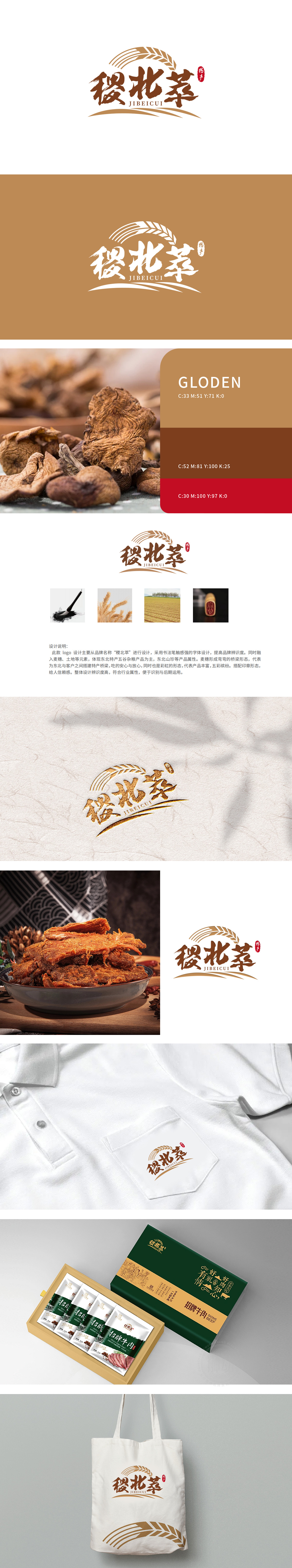
狮动设计以抽象化的金色麦穗为顶部装饰,麦穗颗粒饱满、麦芒向上,麦穗整体呈弧形弯曲,巧妙构成“桥梁”形态,象征品牌作为“东北特产与消费者之间的连接纽带”;同时弧形也暗含“彩虹”寓意,传递产品品类丰富色彩多元的特点,增强视觉联想的层次感。书法笔触的自然流动感,暗合农产品“源自天然”的特质,同时通过手写体的温度感拉近与消费者距离,传递“匠心制作”的理念,多维度传递“安心、丰富、可靠”的品牌联想。
Lion design is decorated with abstract golden ears of wheat, which are full of grains, with upward awns, and the whole ears are curved, cleverly forming a "bridge" shape, symbolizing the brand as a "connecting link between specialty products and consumers in Northeast China"; At the same time, the arc also implies the meaning of "rainbow", which conveys the characteristics of rich and colorful product categories and enhances the layering of visual association.The natural flowing feeling of calligraphy strokes coincides with the nature of agricultural products.


扫码或拨打添加客服微信


