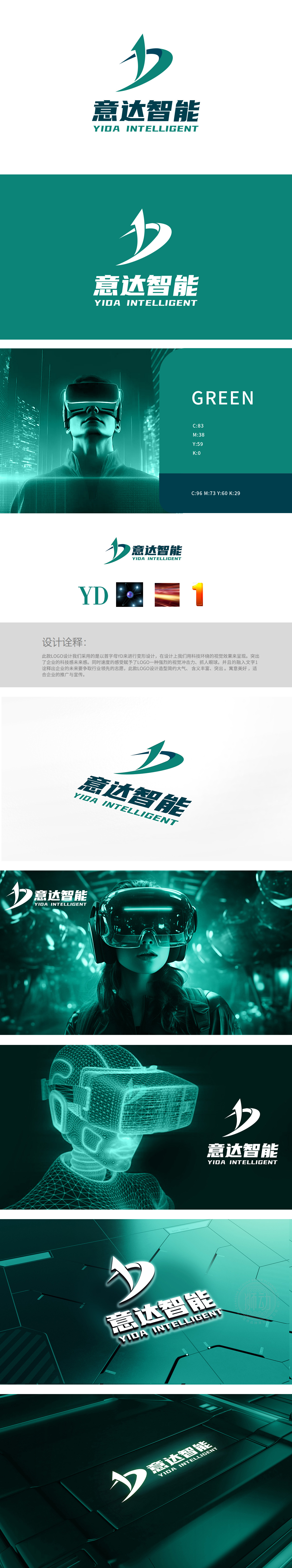
狮动设计以首字母“YD”为创意起点,通过流畅的线条变形融合为一体。左侧“Y”以向上的箭头形态延伸,象征科技驱动的上升动力;右侧“D”以环抱式曲线收尾,整体形成动态平衡的视觉结构。色彩选择采用深绿与浅绿的渐变组合,绿色传递科技感、创新与可持续发展,符合智能科技企业的品牌调性,同时增强视觉清新度与记忆点。整体设计以首字母变形为核心载体,符号化元素为意义延伸,成功将企业名称、行业属性与品牌愿景(科技感、速度感、领先性)深度融合。
Lion design takes the initial letter "YD" as the creative starting point, and is integrated through smooth line deformation. The "Y" on the left extends in the form of an upward arrow, symbolizing the rising power driven by science and technology; The "D" on the right ends with an embracing curve, forming a dynamic and balanced visual structure as a whole. The color selection adopts the gradual combination of dark green and light green, which conveys the sense of science and technology, innovation and sustainable development, conforms to the brand tonality of intelligent technology enterprises, and enhances visual freshness and memory points.


扫码或拨打添加客服微信


