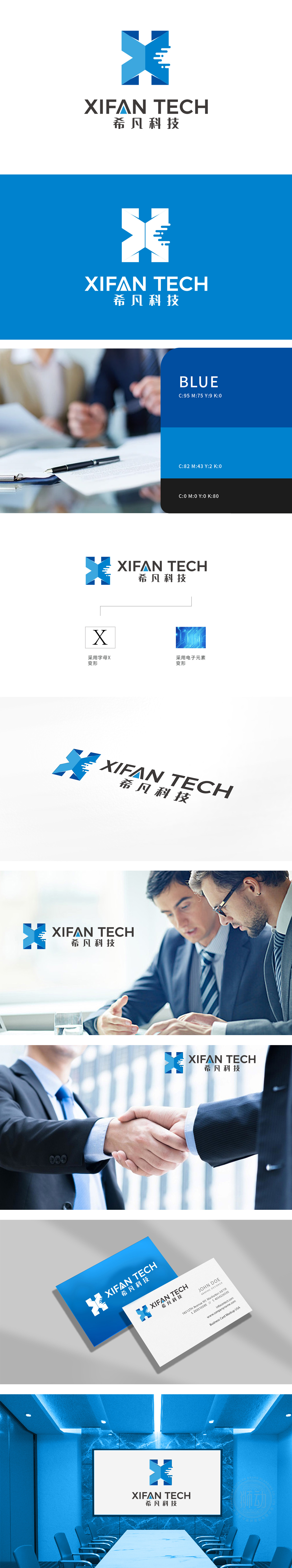
狮动设计以品牌首字母“X”为超级符号,通过蓝白渐变切割+交叉互锁结构,瞬间形成“科技锐度”——左侧深蓝块象征“技术沉淀”,右侧浅蓝块代表“创新活力”,交叉处的锐角三角形直指“突破边界”的品牌主张,整体通过“X”的交叉结构与电子元素的融合,传递用技术连接未来,跨领域合作等核心业务。
Lion Design takes the brand initials "X" as the super symbol, and through the blue-white gradual cutting and cross-interlocking structure, it instantly forms "scientific sharpness"-the dark blue block on the left symbolizes "technical precipitation", the light blue block on the right represents "innovative vitality", and the acute triangle at the intersection points to the brand proposition of "breaking through the boundary".


扫码或拨打添加客服微信


