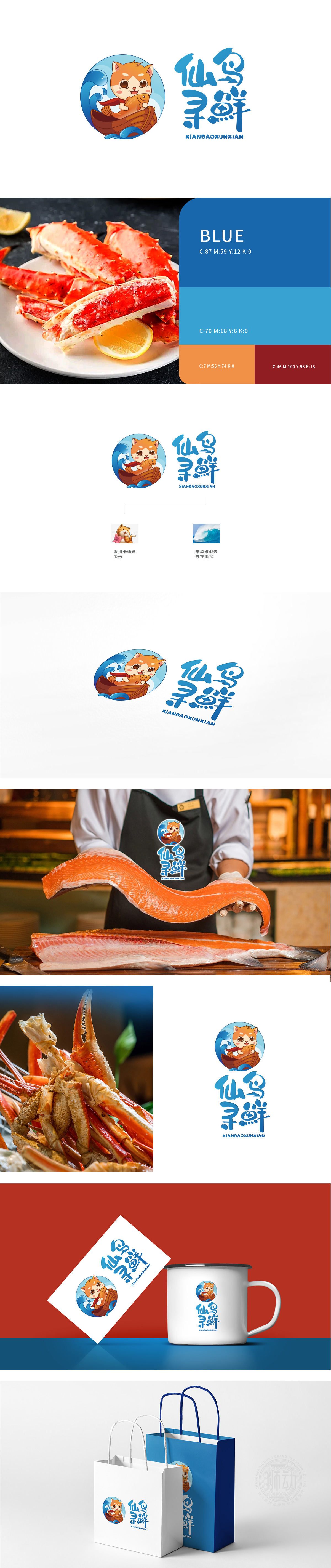
狮动设计以卡通猫与鱼的意象绑定,橘色猫咪采用圆润线条与拟人化设计,传递亲切、可爱的品牌气质,符合餐饮行业“温暖、治愈、亲和力”的消费心理,猫咪怀抱鲜活的橙色鱼,直接点明“鲜”的核心卖点,猫咪乘坐木船漂浮于蓝色波浪中,构建“远洋寻鲜”的故事感——波浪象征海洋/水源,木船隐喻“源头直采”的供应链优势,强化“新鲜、天然、原产地”的餐饮价值主张,描述了从“仙岛”出发,跨越山海,只为捕获第一口新鲜。这不是一家普通的餐饮品牌,而是一个“用趣味传递新鲜,用故事打动味蕾”的餐饮IP。
Lion design is bound by the image of cartoon cat and fish, and orange cat adopts rounded lines and anthropomorphic design, conveying cordial and lovely brand temperament, which conforms to the consumption psychology of "warmth, healing and affinity" in the catering industry. Cats embrace fresh orange fish and directly point out the core selling point of "freshness", and cats float in blue waves in wooden boats, building a story sense of "ocean-seeking freshness"-waves symbolize the ocean/water source. This is not an ordinary catering brand, but a catering IP that "conveys freshness with fun and touches taste buds with stories".


扫码或拨打添加客服微信


