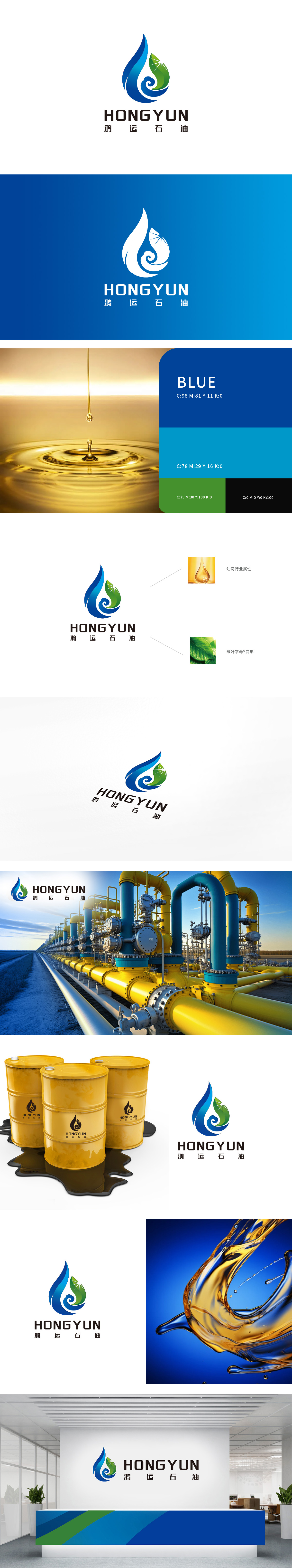
狮动设计以蓝色油滴轮廓为视觉核心,线条流畅且富有动感,直接呼应“石油”行业的液态属性,直观传递“能源”“开采”“炼化”的行业本质,让受众快速建立对品牌的行业认知。蓝色作为主色调,既象征石油资源的深邃与专业,又暗含科技感与可靠性,符合能源企业的稳重形象。“Y”字母变形与绿色环保理念的融合,强化品牌“高效开发+绿色发展”的双重定位。油滴内部的蓝色螺旋线条,既模拟了石油在管道中流动的动态感,又与“鸿运”的“运”字形成语义关联——“运”含“运输、流动、运势”之意,线条的环绕感隐喻资源的高效输送与企业的蓬勃发展态势,强化品牌名“鸿运”的吉祥寓意与行业行动力。
Lion design takes the blue oil drop outline as the visual core, and the lines are smooth and dynamic, which directly echoes the liquid nature of the oil industry, intuitively conveys the industry essence of energy, mining and refining, and allows the audience to quickly establish the industry cognition of the brand. Blue, as the main color, not only symbolizes the profoundness and professionalism of petroleum resources, but also implies the sense of science and technology and reliability, which conforms to the stable image of energy enterprises. The combination of "Y" letter deformation and green environmental protection concept strengthens the dual positioning of brand "efficient development+green development". .


扫码或拨打添加客服微信


