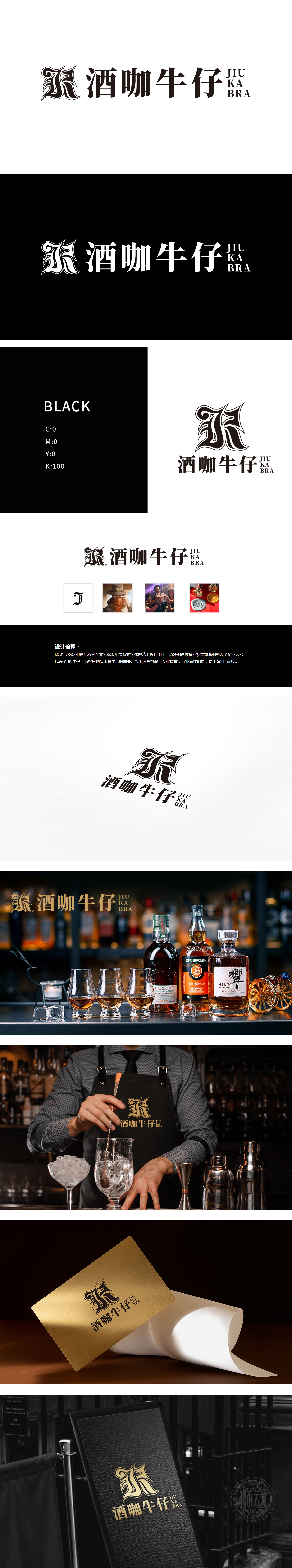
狮动设计采用哥特式字体设计“酒咖牛仔”名称,字体线条锐利、结构繁复,自带复古与个性气质,既强化了“牛仔”的不羁属性,又通过视觉张力传递出酒吧作为“潮流社交空间”的独特定位,“酒咖牛仔”四字与“JIU KA BRA”英文缩写的横向视觉串联,形成“品牌名-业态-精神”的三重传递:“酒咖”直接点明“酒水+咖啡”的核心业务,“牛仔”赋予品牌人格化符号(自由、热情),整体以精准的行业属性提炼(酒吧社交、酒水文化)、鲜明的视觉符号(哥特字体、牛仔基因)成功塑造了一个兼具“复古个性”与“专业品质”的酒吧品牌形象。
Lion design adopts Gothic font to design the name of "Cowboy", with sharp font lines and complicated structure, which has its own retro and personality temperament, which not only strengthens the unruly attribute of "Cowboy", but also conveys the unique positioning of the bar as a trendy social space through visual tension. The word "Cowboy" is connected in series with the horizontal vision of the English abbreviation "JIU KA BRA". Form the triple transmission of "brand name-format-spirit": "wine coffee" directly points out the core business of "wine+coffee", "cowboy" endows the brand with personalized symbols (freedom and enthusiasm).


扫码或拨打添加客服微信


