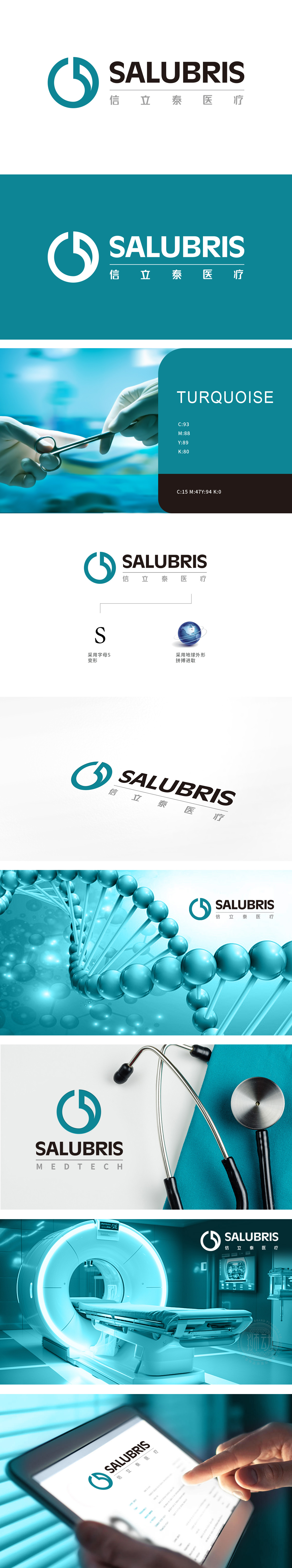
狮动设计采用首字母“S”为原型,环形象征“循环”“完整”,呼应医疗行业“生命健康、持续守护”的核心价值;开放曲线则打破封闭感,传递“开放创新、积极拓展”的品牌态度,线条的上扬趋势暗含“进步与突破”的动态感。整体将医疗服务属性与品牌精神融合,传递“关怀与可靠”的品牌温度。
Lion design takes the initials "S" as the prototype, and the ring symbolizes "circulation" and "integrity", echoing the core values of "healthy life and continuous protection" in the medical industry; The open curve breaks the sense of closure and conveys the brand attitude of "open innovation and active expansion". The upward trend of lines implies the dynamic sense .


扫码或拨打添加客服微信


