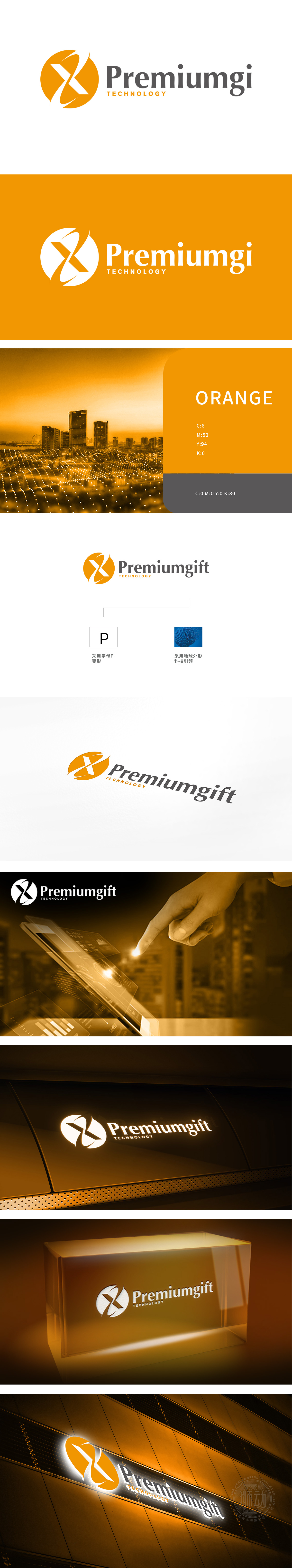
狮动设计以品牌名称首字母“P”为原型,通过流畅的线条切割与旋转,形成类似“X”形的动态负空间设计,传递“连接、突破、无限可能”的科技意象。橙色激发热情与创造力,呈现科技品牌的现代感与亲和力,圆形轮廓也暗合“全球化”“完整性”的企业愿景。通过“字母变形+几何符号”的极简组合,让科技感不止于元素堆砌,而成为品牌故事的直观载体。
Lion design takes the brand name initials "P" as the prototype, and through smooth line cutting and rotation, it forms a dynamic negative space design similar to "X" shape, conveying the scientific and technological image of "connection, breakthrough and infinite possibilities". Orange stimulates enthusiasm and creativity, showing the modernity and affinity of science and technology brands, and the circular outline also coincides with "globalization" and "integrity" of corporate vision. Through the minimalist combination of "letter deformation+geometric symbols", the sense of science and technology is not only piled up by elements, but also becomes an intuitive carrier of brand stories.


扫码或拨打添加客服微信


