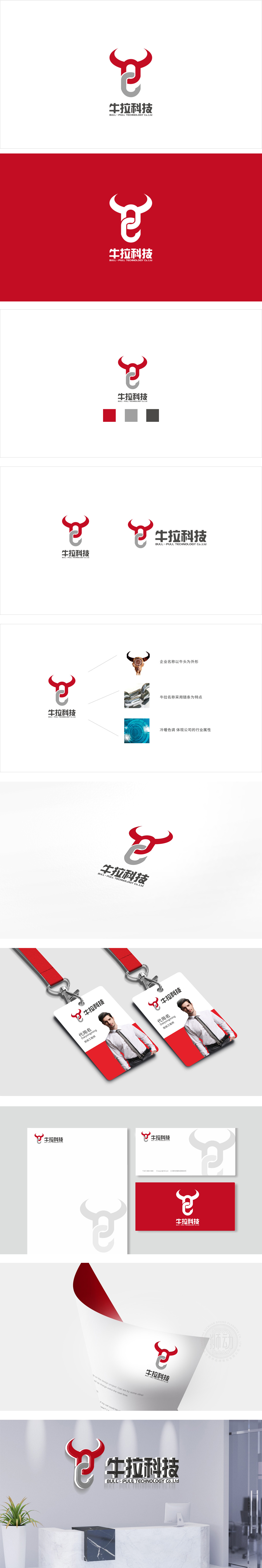
狮动设计采用「牛」(BULL)与「拉」(PULL)为核心意象,用极简的几何形态完成了两者的「视觉绑定」:红色牛角是「牛」的核心识别符号,线条圆润却不失锋芒,既传递了「力量感」,又用红色强化了「活力、热情」的品牌调性;灰色钩子(或「拉环」形态)直接对应「拉」的动作,同时巧妙地与牛角的曲线形成「闭环」,将抽象的品牌名称转化为可感知的视觉故事。通过符号化的意象」「结构化的布局」「调性统一的色彩」,完美实现了「品牌名称-视觉形象-核心价值」的三位一体,既符合科技企业的专业感,又通过「牛」的意象传递了「可靠、有力」的信任感,确实是一枚「懂品牌、懂传播」的好设计。
Lion design adopts "BULL" and "PULL" as the core images, and completes the visual binding of them with minimalist geometry: the red horn is the core identification symbol of "Bull", with rounded lines but no loss of edge, which not only conveys the sense of strength, but also strengthens the brand tonality of "vitality and enthusiasm" with red; The gray hook (or "pull ring" shape) directly corresponds to the "pull" action, and at the same time skillfully forms a "closed loop" with the curve of the horn, transforming the abstract brand name into a perceptible visual story. Through symbolic image, structured layout and tonal unified color, the trinity of brand name.


扫码或拨打添加客服微信


