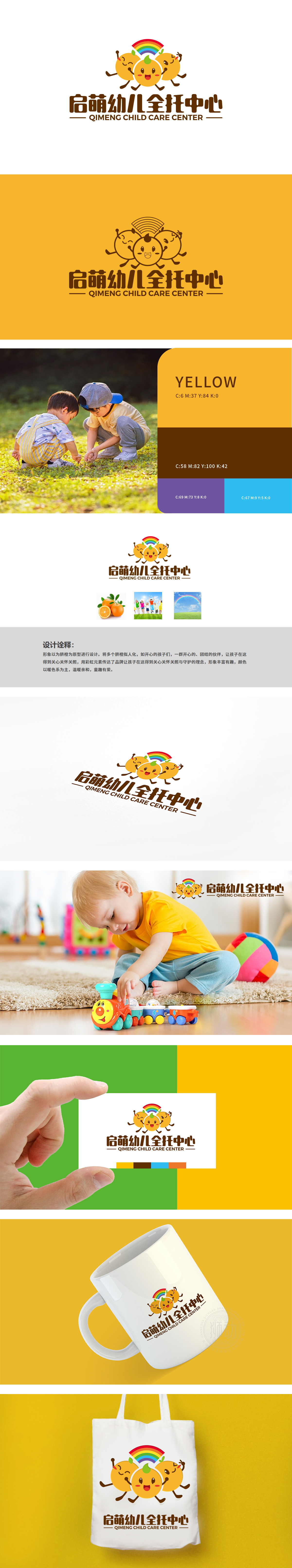
狮动设计通过拟人化脐橙——传递温暖与陪伴,以脐橙为核心视觉符号,橙色作为主色调,既呼应“脐橙”的自然属性,又通过暖色调传递温暖、亲切的氛围,契合幼儿对色彩的感知偏好。三个脐橙被赋予笑脸、手臂和腿部动作,形似一群手拉手的孩子,直观体现“同伴陪伴”“集体生活”的教育理念,同时拟人化形象增强亲和力,符合幼儿对“伙伴”的情感需求,LOGO顶部的彩虹不仅丰富视觉层次,更隐喻“多元关爱”与“美好守护”,与教育机构“呵护成长”的核心价值相契合,暖色调与情感化元素教育理念的视觉化表达,成功塑造了“童趣有爱、温暖守护”的品牌形象。
Lion design conveys warmth and companionship through personification of navel orange, with navel orange as the core visual symbol and orange as the main color, which not only echoes the natural attributes of navel orange, but also conveys a warm and cordial atmosphere through warm colors, which is in line with children's perceptual preference for color. The three navel oranges are endowed with smiling faces, arm and leg movements, which resemble a group of children holding hands, intuitively embody the educational concept of "companion company" and "collective life", and at the same time personify the image to enhance affinity.


扫码或拨打添加客服微信


