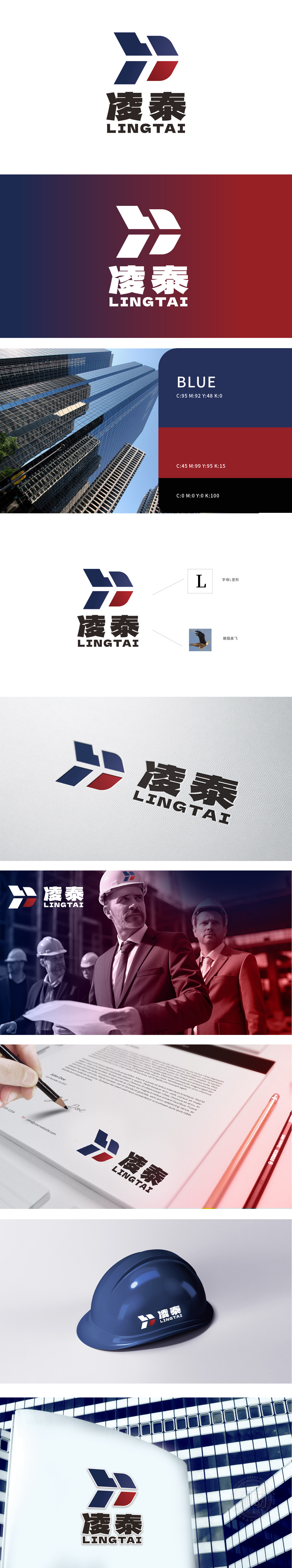
狮动设计以字母“L”(“凌泰”首字母)为创意原点,通过几何切割与对称结构重构,色块的斜向切割如同鹰的双翼展开,打破静态字母的刻板印象,赋予LOGO“向上生长”的力量感,既呼应企业“锐意进取”的愿景,又通过建筑般的“结构美学”将抽象的“飞翔”具象化,采用“小元素,大格局,通过色彩对比、线条方向与意象联想(鹰、飞翔),让几何图形摆脱冰冷感,兼具建筑的“雕塑感”与企业的“生命力”。
Lion design takes the letter "L" (the initials of "Lingtai") as the creative origin. Through geometric cutting and symmetrical structure reconstruction, the oblique cutting of color blocks is like the spreading of eagle wings, which breaks the stereotype of static letters and gives the LOGO a sense of power of "upward growth", which not only echoes the vision of "forge ahead" of enterprises, but also visualizes the abstract "flying" through architectural "structural aesthetics".


扫码或拨打添加客服微信


