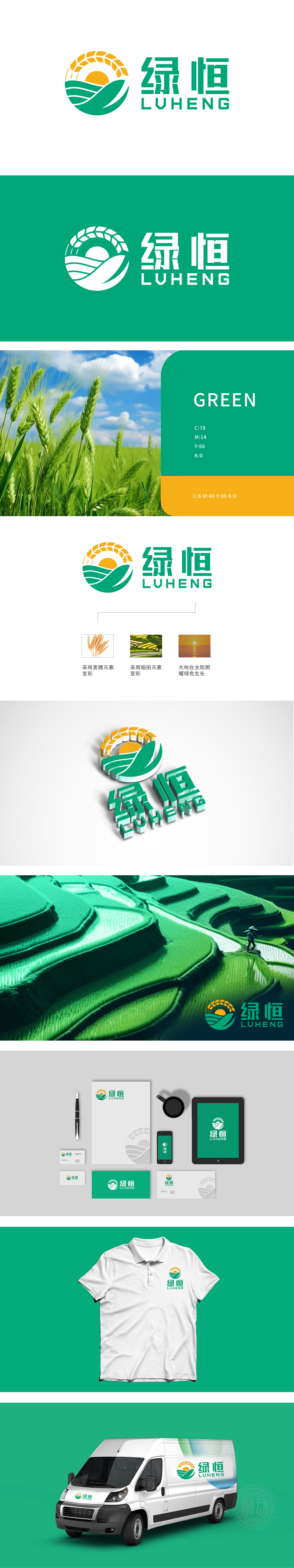
狮动设计以圆形为基底,巧妙融合三大核心农牧元素,构建出兼具自然意象与品牌属性的视觉符号:元素层面:麦穗、稻田、太阳均为农牧行业的“原生符号”,直观传递“种养殖”核心业务;构图层面:圆形结构象征“循环、圆满”,契合农业“春种秋收”的自然规律,也寓意品牌的可持续发展;理念层面:“大地在太阳照耀下绿色生长”的整体叙事,将“绿恒”的品牌主张(绿色农业、恒久品质)融入图形,实现了“视觉符号—行业属性—品牌价值观”的统一。整体呈现“阳光照耀下,绿色作物在沃土中生长”的画面,暗合农牧产业“靠天吃饭、向阳而生”的本质,同时传递“绿色、健康、可持续”的品牌理念。
Based on a circle, Lion Motion Design skillfully integrates three core farming and animal husbandry elements to construct a visual symbol with both natural images and brand attributes: on the element level, ears of wheat, paddy fields and the sun are all "original symbols" of the farming and animal husbandry industry, which intuitively conveys the core business of "breeding"; Composition level: the circular structure symbolizes "circulation and perfection", which conforms to the natural law of "spring planting and autumn harvest" in agriculture and also implies the sustainable development of the brand.


扫码或拨打添加客服微信


