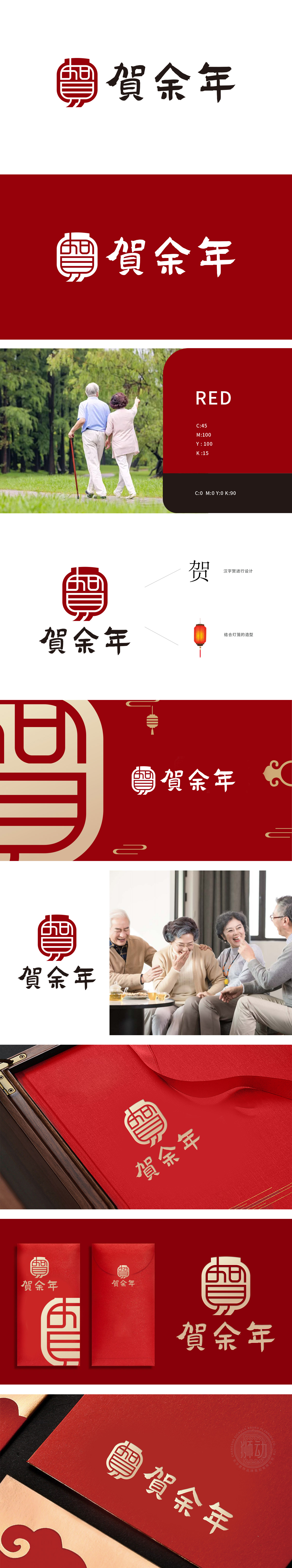
狮动设计以繁体“賀”字为原型,通过线条重构与对称结构,形成类似传统印章的方正轮廓,传递稳重、权威感,贴合医疗康养行业对专业性与信任感的需求。字体设计融入书法笔触,兼具力量与柔和感,暗喻“贺喜安康”的品牌愿景,与康养领域“守护健康、传递关怀”的理念相契合。主图形外部轮廓提取灯笼的圆润形态,红色主色调象征温暖、吉祥,既是节日喜庆的符号,也可延伸为“照亮健康之路”“温暖守护”的隐喻,贴合医疗服务中“关怀”“希望”的情感价值。:从“喜庆”到“关怀”的延伸,传统与专业的平衡,既保留了东方美学的韵味,又赋予其医疗康养领域的专属内涵——以“温暖守护”为核心,传递“专业可靠、关怀备至”的品牌形象。
Lion design is based on the traditional word "He", and through line reconstruction and symmetrical structure, it forms a square outline similar to the traditional seal, conveys a sense of stability and authority, and meets the needs of the medical and health care industry for professionalism and trust. The font design is integrated with calligraphy strokes, which has both strength and softness, and is a metaphor for the brand vision of "Happy Happiness and Well-being", which is in line with the concept of "protecting health and conveying care" in the field of health care. The outline of the main figure extracts the round shape of the lantern, and the red main color symbolizes warmth and auspiciousness, which is not only a symbol of festivals and celebrations, but also a metaphor of "illuminating the road to health" and "warm protection".


扫码或拨打添加客服微信


