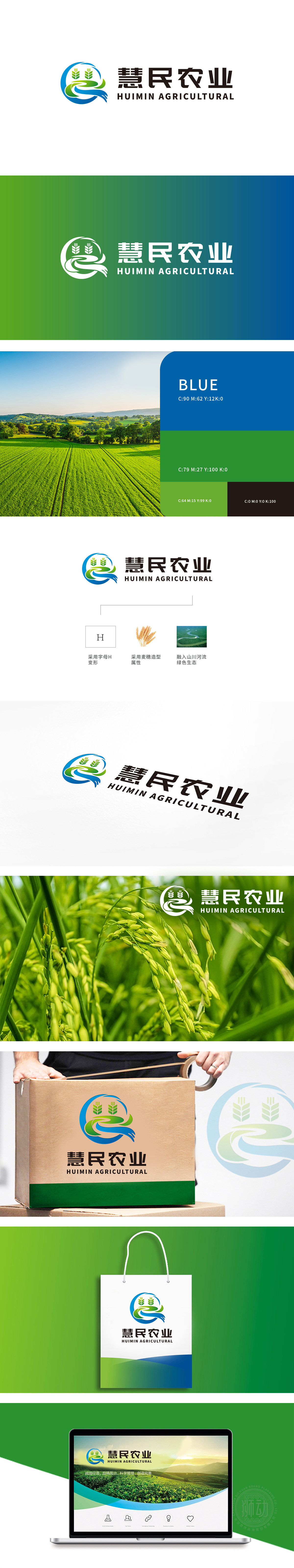
狮动设计以抽象的“H”(慧民首字母)为骨架,通过流畅的曲线与自然元素融合,麦穗元素,顶部呈金黄色渐变(隐含成熟与丰收),底部与“H”线条衔接自然,直接点明“农业种植”属性,传递农牧渔业“耕耘-收获”的产业本质,同时麦穗的向上生长态势象征生命力与丰产希望。蓝色与绿色的流动曲线,既抽象表现“山川河流”的地理意象又形成“水流滋养土地、土地孕育作物”的生态闭环。整体构图与行业隐喻圆形轮廓,完美诠释“慧民农业”作为现代化农牧企业的“生态、智慧、惠民”定位。
Liondesign takes the abstract "H" (the initials of Huimin) as the skeleton, and blends with natural elements through smooth curves. The top of the wheat ear element is gradually golden (implying maturity and harvest), and the bottom is connected with the "H" line, which directly points out the attribute of "agricultural planting" and conveys the industrial essence of "cultivation-harvest" of agriculture, animal husbandry and fishery. At the same time, the upward growth trend of the wheat ear symbolizes vitality and high-yield hope. The flow curve of blue and green not only abstractly expresses the geographical image of "mountains and rivers" but also forms an ecological closed loop of "water nourishes land and land breeds crops".


扫码或拨打添加客服微信


