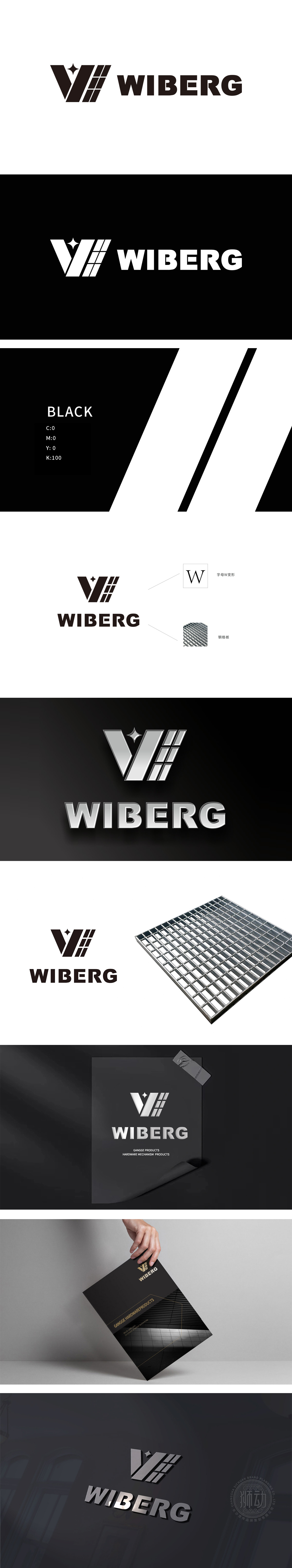
狮动设计由字母“W”的抽象简化:作为识别的核心锚点;又通过“直线条”传递出工业感、规整性;顶部的小钻石是点睛之笔:打破几何图形的生硬感,增加了精致度与品质感。 WIBERG的标志,不是设计,是工业基因的视觉锻造。整体形态传递出力量、可靠、向前的动势,符合工业品牌的核心形象。
Lion design is simplified by the abstraction of the letter "W": as the core anchor point of recognition; It also conveys a sense of industry and regularity through "straight lines"; The small diamond at the top is the crowning touch: it breaks the stiffness of geometric figures and increases the sense of exquisiteness and quality. WIBERG's symbol is not design, but visual forging of industrial genes. The overall form conveys a powerful, reliable and forward momentum, which is in line with the core image of industrial brands.


扫码或拨打添加客服微信


