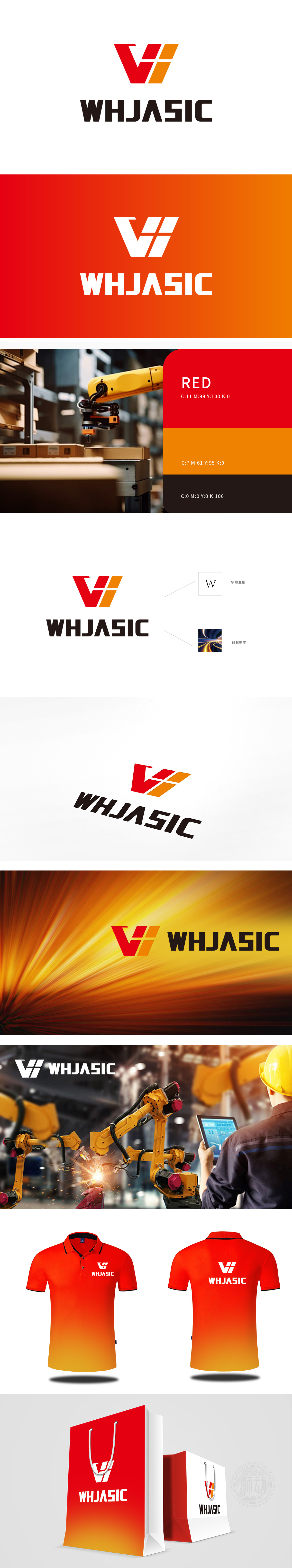
狮动设计采用字母“W”的五金器械化演绎,红色与橙色组成的“V”形图案,实为字母“W”的抽象变形,通过锐利的折线、厚重的色块堆叠,暗合五金器械的“金属质感”与“精密拼接”特性。色彩上,红色传递力量与专业,橙色增添活力,符合工业领域“可靠且创新”的品牌调性。整体通过“字母符号化→行业属性可视化→情感价值传递”的三层转化,既满足了行业辨识度,又以色彩对比与动态元素突破传统工业设计的刻板印象,展现出对“图形语言与行业属性融合”的深刻理解,强化了品牌在五金器械领域“突破、高效、技领先”的定位。
Lion design is interpreted by the letter "W" as a hardware instrument, and the "V" pattern composed of red and orange is actually an abstract deformation of the letter "W", which coincides with the characteristics of "metal texture" and "precision splicing" of hardware instruments through sharp broken lines and thick color blocks. In color, red conveys strength and professionalism, and orange adds vitality, which conforms to the brand tonality of "reliable and innovative" in the industrial field. showing a deep understanding of "integration of graphic language and industry attributes" and strengthening the brand's positioning of "breakthrough, high efficiency and leading technology" in the field of hardware and equipment.


扫码或拨打添加客服微信


