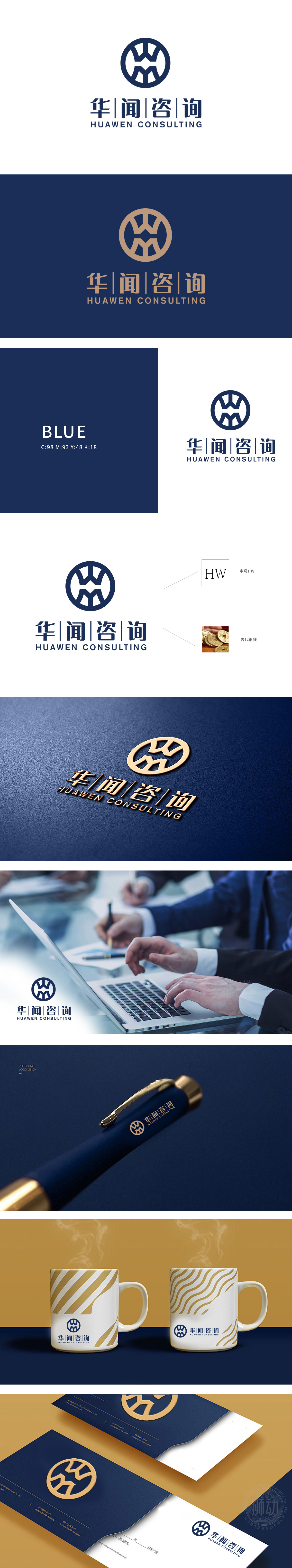
狮动设计以首字母“HW”的变形组合,通过线条的穿插传递“沟通、互联、协作”的咨询行业核心价值。圆形轮廓象征“圆满、专业、全球化视野”,线条的硬朗感则强化了咨询服务的严谨性与权威性,符合商业咨询机构的专业形象定位。古代铜钱的文化隐喻,外圆内方的轮廓,暗合“天圆地方”的传统文化哲学,既传递“合规经营、稳重可靠”的信任感,又巧妙关联咨询服务与“价值创造、财富管理”的行业属性,增强品牌在金融/商业咨询领域的记忆点。整体通过传统文化符号(铜钱)建立情感信任,通过字母结构(HW)强化品牌专属感,通过配色与字体传递专业属性,最终实现“客户看见符号→联想到价值→选择华闻”的商业闭环。
Lion Motion Design conveys the core value of "communication, interconnection and cooperation" in the consulting industry through the combination of the initials "HW". The circular outline symbolizes "a complete, professional and global vision", and the sense of toughness of lines strengthens the rigor and authority of consulting services, which is in line with the professional image positioning of commercial consulting institutions. The cultural metaphor of ancient copper coins, the outline inside the outer circle, coincides with the traditional cultural philosophy of "heaven and earth".which not only conveys the trust of "compliance management, stability and reliability", but also skillfully associates consulting services with the industry attributes of "value creation and wealth management" and enhances the brand's memory in the financial/commercial consulting field.


扫码或拨打添加客服微信


