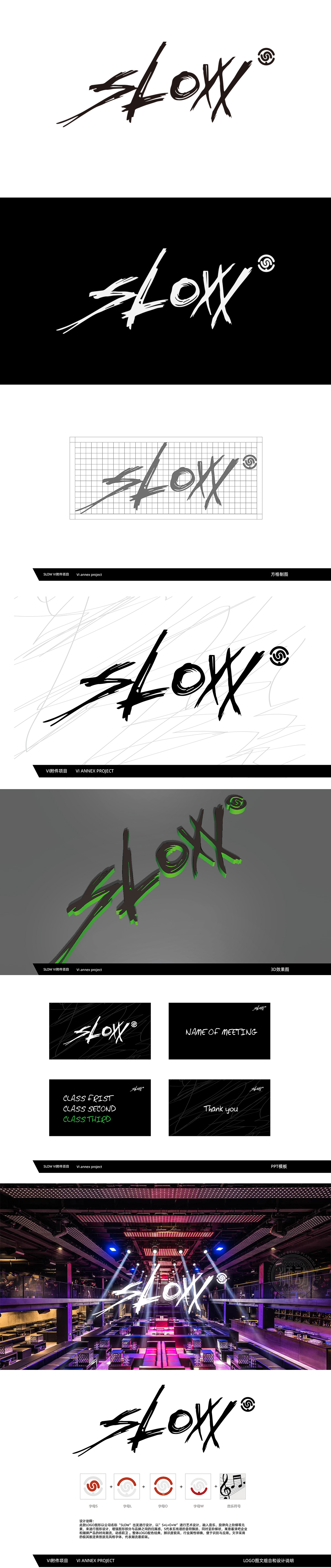
狮动设计基于品牌名“SLOW”为核心,通过“S+L+O+W+音乐符号”的模块化设计,将字母形态与娱乐文化基因紧密绑定:由四个变体旋螺(分别对应S/L/O/W)构成主视觉符号,红色螺旋线条既呼应“声波传播”的听觉意象,又以“阶梯向上”的动感曲线传递音乐旋律的韵律感,暗合娱乐场景中节奏起伏、情绪递进的体验。主文字“Slow”采用粗犷、自由的手写笔触,线条锋利且富有张力,搭配旋螺图形的流动感,形成“动静对比”——既保留了娱乐场所所需的活力与个性,又通过“慢(Slow)”的名称反讽,传递以“音乐为媒,慢享体验”“沉浸式享受、放慢节奏”的品牌主张,契合酒吧、潮流文化场景中“放松与释放”的核心需求。
Lion Design is based on the brand name "SLOW", and through the modular design of "S+L+O+W+ music notation", the letter form is closely bound with the entertainment culture gene: four variant snails (corresponding to S/L/O/W respectively) form the main visual symbol, and the red spiral lines not only echo the auditory image of "sound wave propagation", but also move up in steps. The main character "Slow" uses rough and free handwritten strokes, with sharp lines and full of tension, and with the flowing sense of spiral graphics, it forms a "dynamic and static contrast"-it not only retains the vitality and personality required by entertainment venues, but also conveys the brand proposition of "taking music as the medium, enjoying the experience Slowly and slowing down the pace" through the irony of the name "slow".


扫码或拨打添加客服微信


