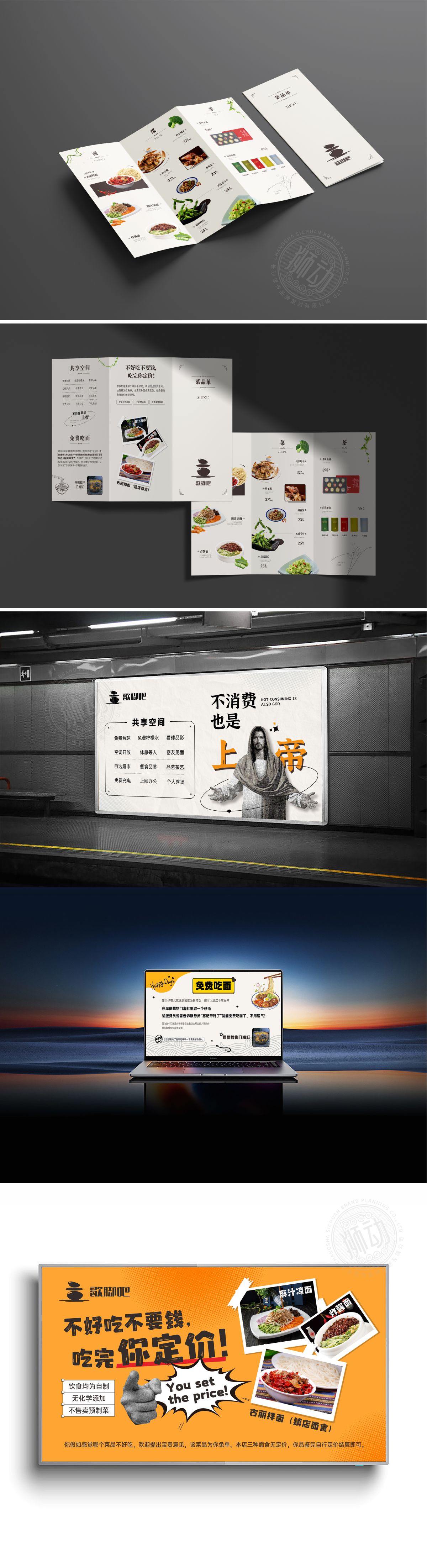
狮动为歇脚吧餐吧打造的视觉识别系统,以“轻松、温馨、品质”为核心理念。Logo设计融合“石堆”意象,象征稳固与休憩,搭配暖色调渐变,传递舒适氛围。菜单设计采用模块化分区,图文结合突出菜品特色,“面/菜/茶”分类清晰,价格标注醒目。合上菜单封面以简洁排版强化品牌名与slogan,整体风格兼顾实用性与美感。狮动通过精准的品牌语言转化与视觉符号创新,助力歇脚吧在竞争激烈的餐饮市场中脱颖而出,有效提升顾客记忆点与用餐体验。
The visual identification system created by Lion Motion for the rest bar takes "lightness, warmth and quality" as the core concept. Logo design combines the image of "stone pile", symbolizing stability and rest, with warm tone gradient, conveying a comfortable atmosphere. The menu design adopts modular partition, the combination of pictures and texts highlights the characteristics of dishes, the classification of "noodles/vegetables/tea" is clear, and the price tag is eye-catching. Close the menu cover to strengthen the brand name and slogan with concise typesetting, and the overall style takes into account practicality and aesthetics.


扫码或拨打添加客服微信


