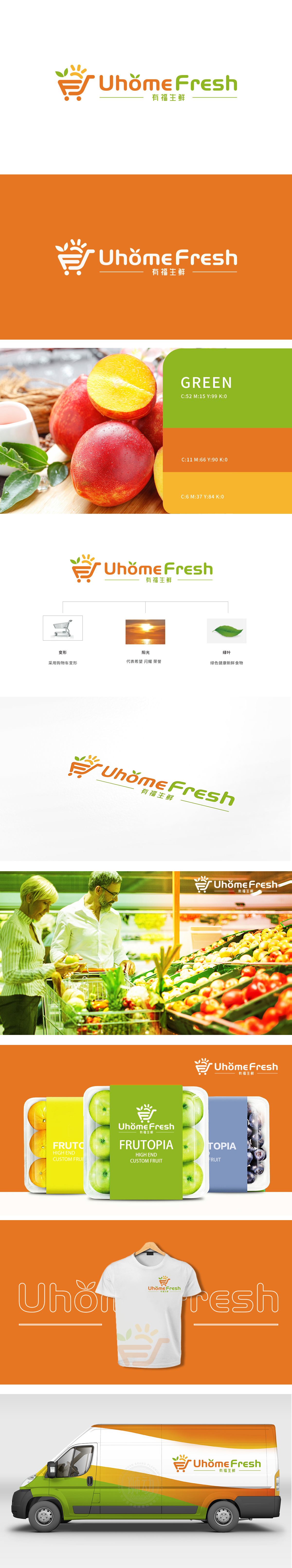
狮动设计采用一个购物车和太阳组成,购物车象征着百货商超的购物体验,太阳则象征着自然、健康和希望。UhomeFresh 有福生鲜:品牌名称简洁明了,传达了“新鲜”和“福气”的概念,暗示产品的新鲜度和高品质。当购物车以流线型金属骨架破界而出,当朝阳以金芒穿透品牌名“UhomeFresh”的字母间隙,当两片绿叶以45°角在右下角形成鲜嫩夹角——有福生鲜的LOGO以三重符号暴击视觉,瞬间解构消费者对生鲜品牌的固有想象。借“立体绿叶”锁定健康心智,新客户直呼:“这是订购一车晨光与鲜活!”
Lion design consists of a shopping cart and the sun. The shopping cart symbolizes the shopping experience of department stores, while the sun symbolizes nature, health and hope. UhomeFresh is blessed with freshness: the brand name is concise and clear, which conveys the concepts of "freshness" and "happiness" and implies the freshness and high quality of products. When the shopping cart breaks through the boundary with a streamlined metal skeleton, when the morning sun penetrates the letter gap of the brand name "UhomeFresh" with a golden awn, and when two green leaves form a fresh angle in the lower right corner at an angle of 45 degrees, the blessed fresh LOGO violently attacks the vision with triple symbols, instantly deconstructing consumers' inherent imagination of fresh brands. With the "three-dimensional green leaves.


扫码或拨打添加客服微信


