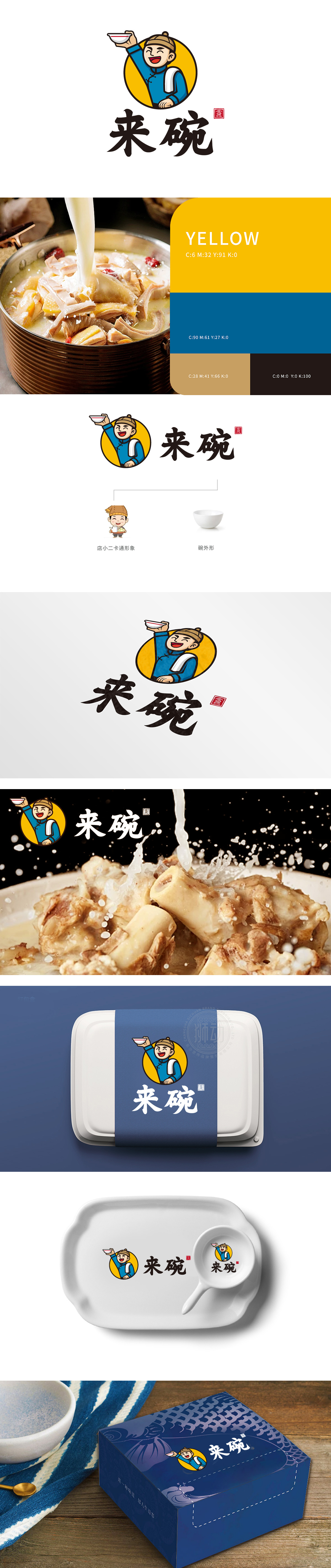
狮动设计用消费者熟悉的“传统符号”,快速建立“餐饮”“亲切”“正宗”的认知:店小二卡通形象:蓝布衫、瓜皮帽、肩搭白毛巾、手举碗的动作,是中国传统小吃店“店小二等位”的经典场景再现。传递“这家店像你家楼下的老面馆,熟悉、踏实”。来碗”书法字:用厚重的毛笔字体,笔画舒展,像老店铺的招牌字,既保留了传统韵味,又因为“口语化”而显得亲切自然。设计的巧思在于用“传统符号”建立信任,用“卡通形象”降低距离,用“简洁布局”传递核心,快速建立“餐饮”“亲切”“正宗”的认知。
Lion design uses the traditional symbols familiar to consumers to quickly establish the cognition of "catering", "kindness" and "authenticity": the cartoon image of the bartender: blue cloth shirt, melon hat, white towel on the shoulder and holding a bowl, which is a classic scene representation of the "bartender's equal position" in China traditional snack bar. Pass "this shop is like the old noodle restaurant downstairs in your house, familiar and practical." The calligraphy character "Lai Bowl": With a thick brush font, the strokes stretch, like the signboard of an old shop, which not only retains the traditional charm, but also appears cordial and natural because of "colloquialism".


扫码或拨打添加客服微信


