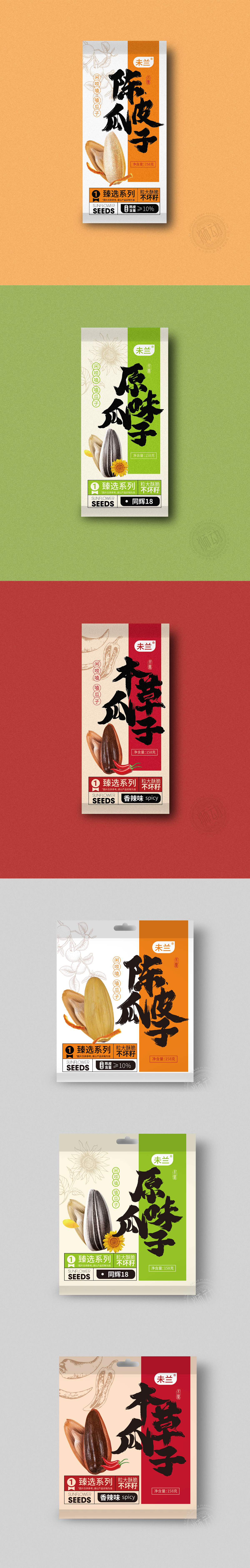
狮动设计以用“递进式焦点”高效传递信息,用浓墨重彩的书法字,直接点出产品名称,同时用橙色色块作为背景,强化“食欲感”。书法字体的“中式粗犷”与产品“传统口味”强关联,瞬间抓住对“陈皮+瓜子”组合感兴趣的消费者。用设计语言“翻译”产品的核心优势——让“陈皮瓜子”的“传统味”“高品质”“足料”,通过视觉元素“直接被看到”。
Lion design uses "progressive focus" to convey information efficiently, and directly points out the product name with thick and colorful calligraphy characters, and at the same time uses orange color blocks as the background to strengthen "appetite". The "rough Chinese style" of calligraphy fonts is strongly related to the "traditional taste" of products, which instantly captures consumers interested in the combination of "dried tangerine peel+melon seeds". Translate the core advantage of the product with design language-let the traditional taste, high quality and sufficient material of "dried tangerine peel and melon seeds" be directly seen through visual elements.


扫码或拨打添加客服微信


