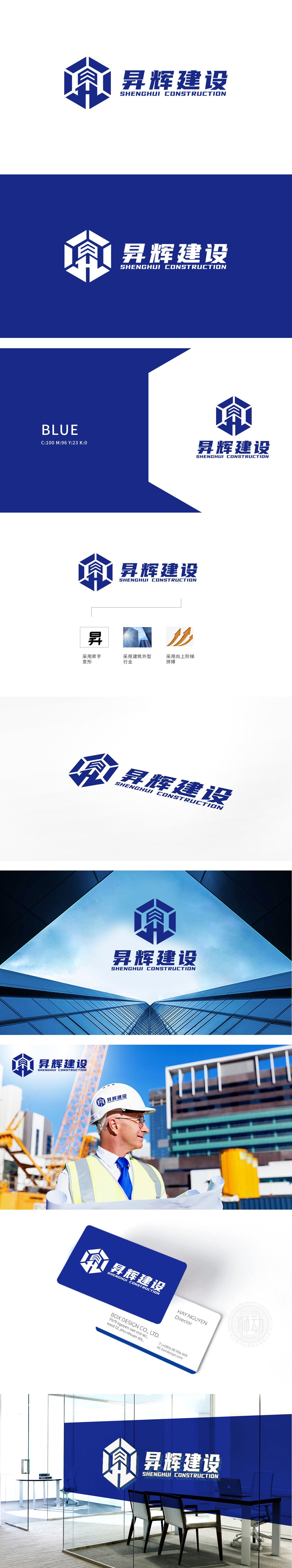
狮动设计用建筑的“生长感”击穿认知,你见过“会生长的LOGO”**吗?昇辉建设的左侧图形,像极了建筑从地基里“长”出来的样子,六边形的框架,是建筑的地基,棱角分明、稳如磐石,像工程队打下的第一根桩,代表“建设的根本:坚固”;框架里的“H”字,是建筑的躯干:竖线像立柱,支撑起整个结构;上半部分的“阶梯状轮廓”,像楼宇的楼层叠加,又像传统建筑的坡屋顶(藏着“家”的温度)整体用“最简洁的视觉语言”(六边形、H、宝蓝色)传递了出来,让logo不仅“好看”,更“有用”。这就是“懂行业、懂用户”的设计能力。
Lion design uses the "sense of growth" of architecture to penetrate cognition. Have you seen the "LOGO”** that will grow" The figure on the left side of Shenghui Construction looks like a building "growing" from the foundation. The hexagonal frame is the foundation of the building, angular and rock-solid, like the first pile laid by the engineering team, representing "the foundation of construction: firmness"; The "H" in the frame is the trunk of the building: vertical lines are like columns to support the whole structure; The "stepped outline" in the upper part.


扫码或拨打添加客服微信


