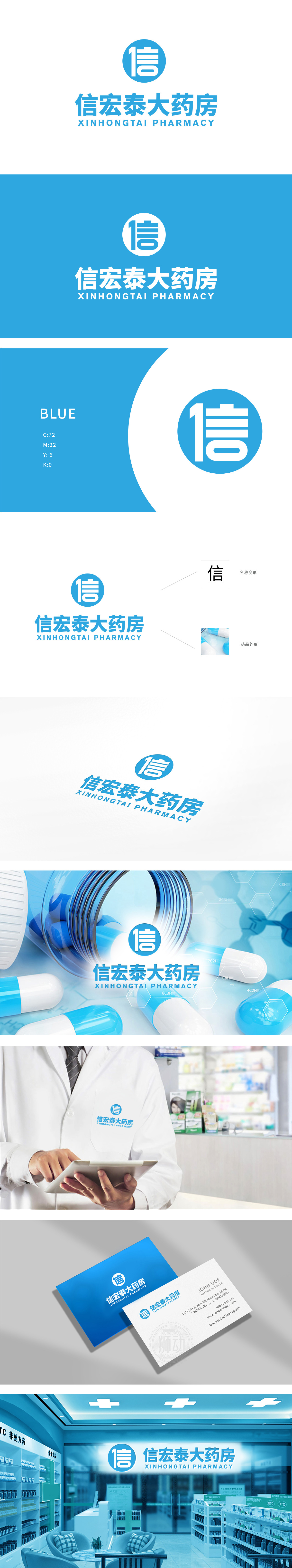
狮动设计将药房的核心需求定位是建立“安全、可靠、专业”的品牌形象,而该LOGO的设计完全围绕这一需求展开:信任传递:“信”字作为核心符号,直接点出“诚信经营”的理念;蓝色与圆形的组合,关联医疗行业的经典视觉,让消费者直观感受到“这是一家专业的药房”;“大药房”的中文名称与加粗字体结合,传递“规模大、品种全”的信息。用最简的元素传递了最核心的信息:对消费者:“这是一家诚信、专业、可靠的大药房”。
Lion Design positioned the core requirement of pharmacy as establishing a "safe, reliable and professional" brand image, and the design of the LOGO completely revolved around this requirement: trust transmission: the word "letter" as the core symbol directly points out the concept of "honest management"; The combination of blue and circle is related to the classic vision of the medical industry, which makes consumers intuitively feel that "this is a professional pharmacy"; The Chinese name of "Pharmacy" is combined with bold font to convey the message of "large scale and complete variety". The core message is conveyed with the simplest elements: to consumers: "This is an honest, professional and reliable pharmacy".


扫码或拨打添加客服微信


