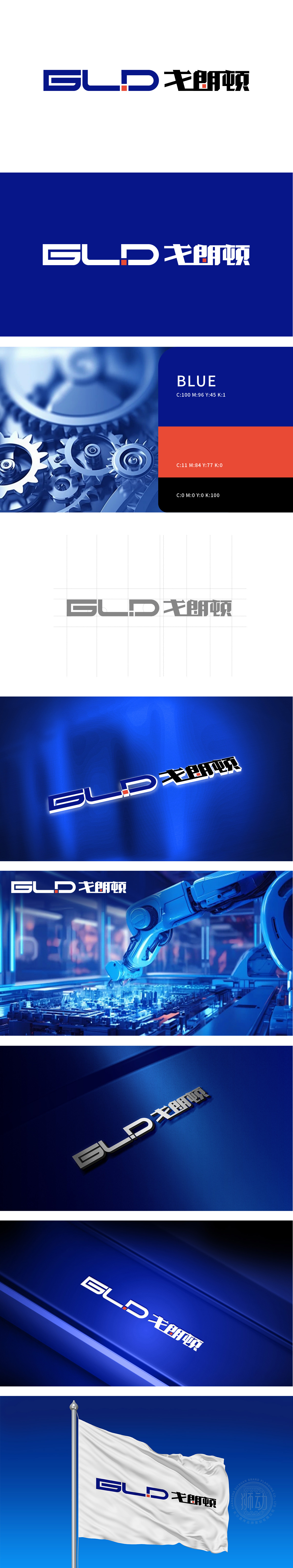
狮动设计采用“GLD”字母几何化变形,以蓝色为主调,通过直线与曲线的组合,将字母形态简化为更具记忆点的符号——“G”的闭合框、“L”的延伸线、“D”的半圆,既保留了字母的识别性,又强化了科技品牌的专业感;中间的红色小方块作为视觉锚点,打破蓝色的沉闷,同时呼应“戈朗顿”中文名中的“顿”字(顿挫感),形成“刚柔并济”的平衡。用最简洁的视觉语言,传递最核心的品牌价值 “高效协同”。
Lion Design adopts geometric deformation of "GLD" letters, with blue as the main tone. Through the combination of straight lines and curves, the letter shape is simplified into symbols with more memory points-closed box of "G", extended line of "L" and semicircle of "D", which not only retains the recognition of letters, but also strengthens the professional sense of science and technology brands. As a visual anchor, the small red square in the middle breaks the blue dullness and echoes the word "Dun" in the Chinese name of "Grandon", forming a balance of "combining rigidity with softness".


扫码或拨打添加客服微信


