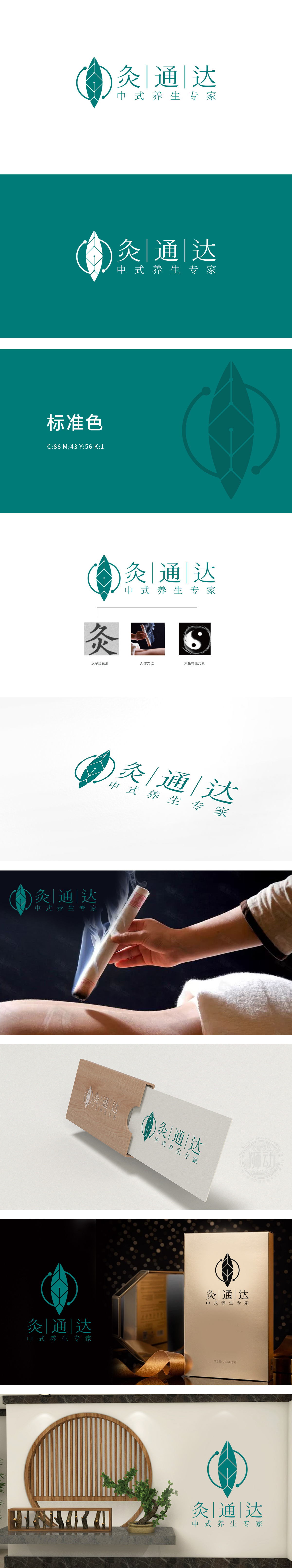
狮动设计以抽象化的“艾草叶”为主体造型,叶片轮廓呈对称三角形态,线条凝练且富有向上的生长感,既呼应“灸疗”核心原料(,又传递自然、健康的品牌属性,叶片内部以几何菱形网格填充,网格节点通过曲线连接,形成类似“经络穴位”的视觉隐喻,巧妙融合中医“疏通经络、调和气血”的养生理念,暗合品牌名中“通”“达”二字的核心价值。整体通过艾草叶、经络网格、太极曲线等元素的三者融合,将中医养生的专业性、自然健康的品牌调性与现代设计的简洁美学完美平衡。
Lion design takes the abstract "wormwood leaf" as the main shape, and the outline of the leaf is in a symmetrical triangle shape, with concise lines and a sense of upward growth, which not only echoes the core raw material of moxibustion, but also conveys the natural and healthy brand attributes. The interior of the leaf is filled with geometric diamond grids, and the grid nodes are connected by curves, forming a visual metaphor similar to "meridians and acupoints", which skillfully integrates the health care concept of "dredging meridians and harmonizing qi and blood" in traditional Chinese medicine.


扫码或拨打添加客服微信


