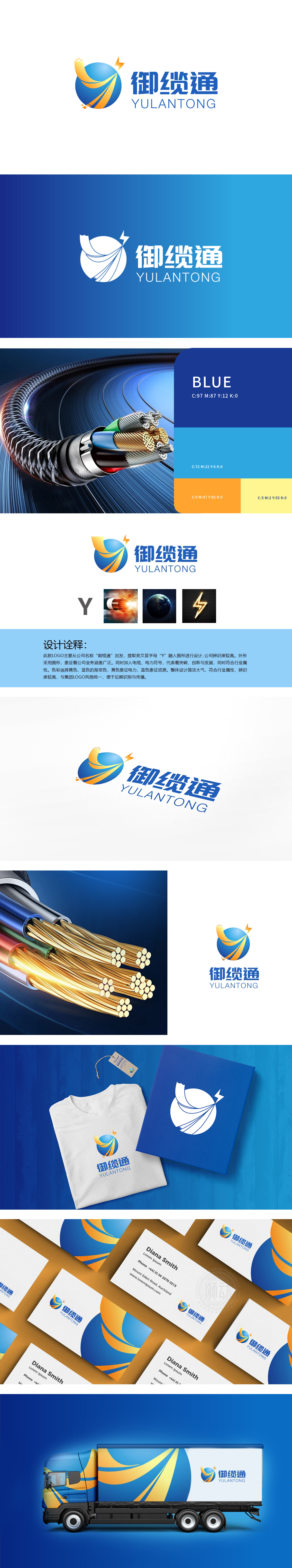
狮动设计提取英文首字母“Y”作为视觉核心,通过圆形载体将字母变形融入——圆形既象征公司业务“覆盖广泛”,又通过流畅的线条(模拟电缆的“延伸感”与“传输性”。将“品牌标识”与“行业特征”进行了语义关联:黄色是电流的跳动,蓝色是资源的沉淀,两种颜色撞在一起,刚好是“电缆”最本质的模样:把电力从源头传向每一个需要的地方,用视觉语言“讲透”电缆的本质。
Lion Design takes the English initial "Y" as the visual core, and transforms the letters into it through a circular carrier-the circle not only symbolizes the "wide coverage" of the company's business, but also simulates the "extension" and "transmission" of the cable through smooth lines. The "brand identity" and "industry characteristics" are semantically related: yellow is the beating of current, and blue is the precipitation of resources. The collision of the two colors is just the most essential appearance of "cable": transmitting power from the source to every place where it is needed, and "telling through" the essence of cable with visual language.


扫码或拨打添加客服微信


