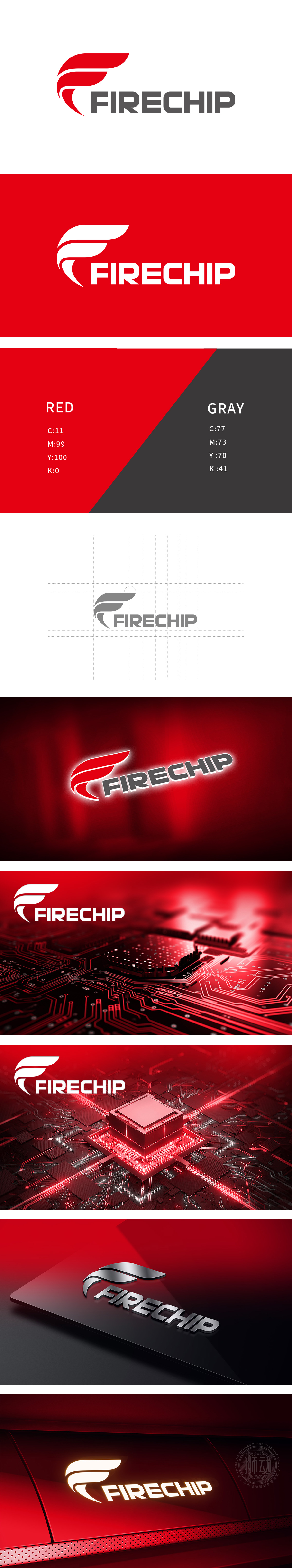
狮动设计采用了「F」字母变形+火焰/翅膀的意象融合,传递「激情、动力、突破」的科技感,「翅膀」的形态,暗示「成长、跃升、技术赋能」的企业愿景,强化「科技驱动未来」的品牌联想。红灰配色→ 既符合科技企业的「前沿感」,又通过灰色传递「技术可靠」的信任度,整体设计简洁与科技感的统一,精准传递品牌定位。
Lion Design adopts the image fusion of "F" letter deformation and flame/wings, conveying the sense of science and technology of "passion, motivation and breakthrough". The shape of "wings" implies corporate vision of "growth, leap and technological empowerment" and strengthens the brand association of "technology drives the future". Color matching of red and gray → not only conforms to the "cutting-edge sense" of science and technology enterprises.


扫码或拨打添加客服微信


