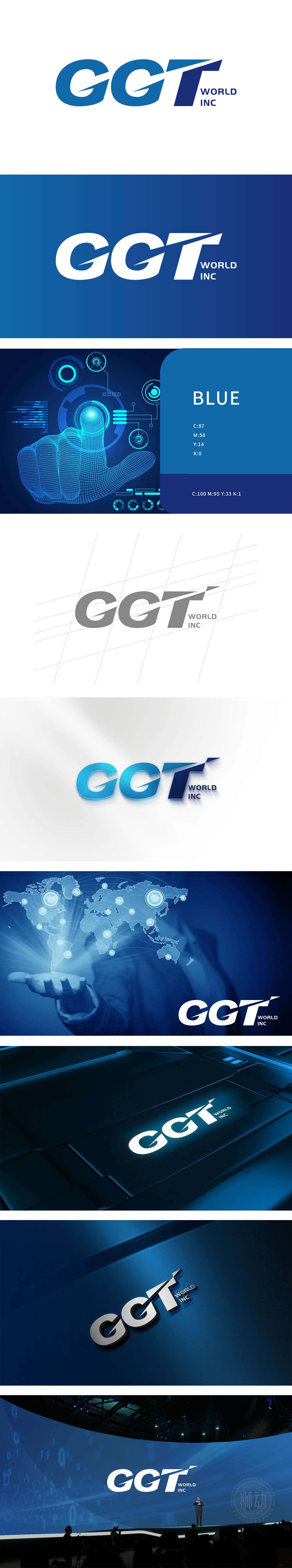
狮动设计将“CGT”用无衬线粗体,笔画简洁、棱角分明,自带现代感与力量感;字母“T”的斜切处理是点睛之笔——倾斜的线条模拟了“前进”或“流动”的动势,既暗示电商行业“快节奏、高迭代”的特点,也让静态logo有了“生命力”,更符合电商核心群体的审美。把电商品牌的“隐性需求”转化为“视觉语言,传递”高效、创新、全球”的品牌价值。
Lion design uses "CGT" in sans serif bold, and the strokes are simple and angular, with a sense of modernity and strength; The oblique cutting of the letter "T" is the finishing touch-the oblique lines simulate the dynamic trend of "forward" or "flow", which not only implies the characteristics of "fast pace and high iteration" in the e-commerce industry, but also gives the static logo "vitality", which is more in line with the aesthetics of the core group of e-commerce.


扫码或拨打添加客服微信


