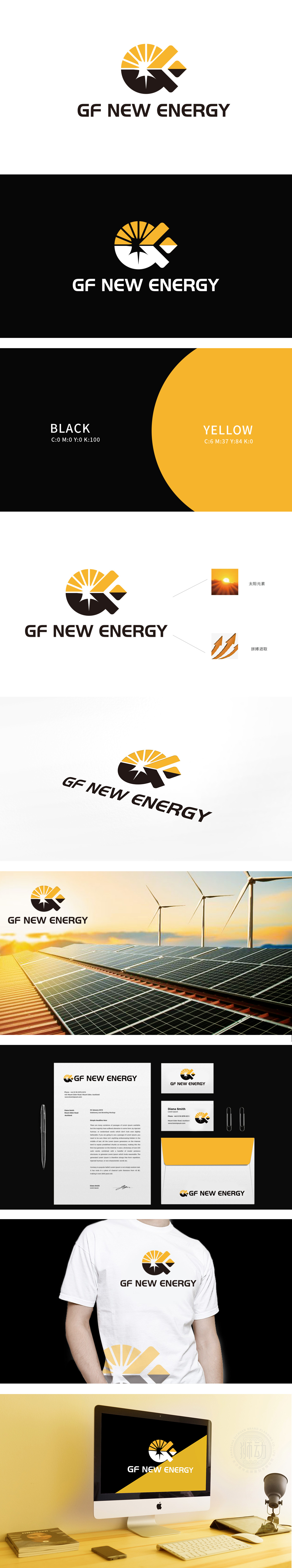
狮动设计从“能源本质”出发,用极简元素完成了对“化工石油→新能源”的视觉转译:太阳元素:能源的“源头符号”,它象征着“能源的可持续性”。箭头的“向上趋势”与“重叠设计”,既模拟了能源流动的动感,也传递了企业“在新能源领域开拓奋进”的决心。整体设计把行业的“隐情”、企业的“初心”、未来的“野心”,全变成能看见、能感知、能共鸣的图形。构建化工石油与新能源的“视觉桥梁”。
Lion Based on "the essence of energy", Lion Motion Design completed the visual translation of "chemical oil → new energy" with minimalist elements: the sun element: the "source symbol" of energy, which symbolizes "the sustainability of energy". The "upward trend" and "overlapping design" of the arrow not only simulate the dynamics of energy flow, but also convey the determination of enterprises to "forge ahead in the field of new energy".


扫码或拨打添加客服微信


