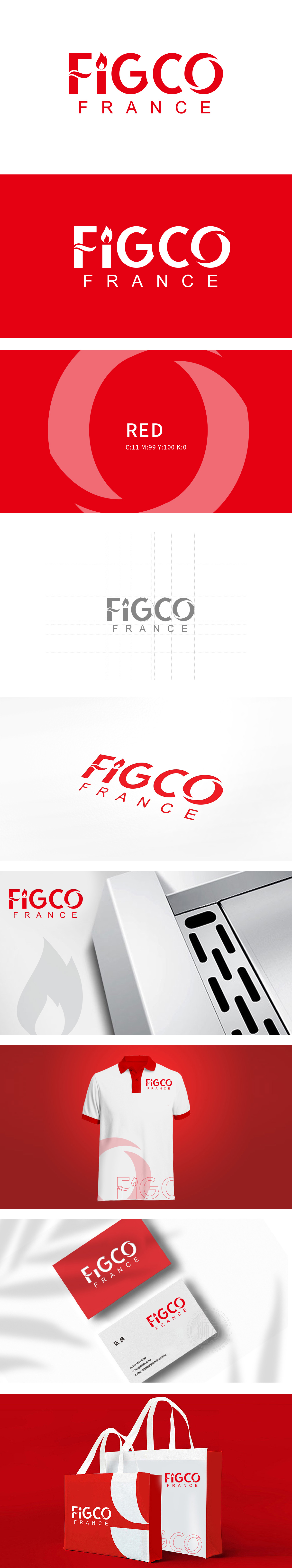
狮动设计采用“主标识+副标”的经典结构,以高饱和度红色为视觉主调,传递强烈的情绪张力与记忆点,主标识“FIGCO”:符号化的品牌语言,“F”字母的创意变形:火焰+波浪的组合符号——火焰象征热情、创新、技术的“热度”,波浪则模拟电流、数据或信号的流动。将抽象的“科技感”转化为可感知的视觉符号,“O”字母的循环弧度:“传递出“可持续性”“闭环生态”**的概念,让品牌理念“看得见、记得住”,最终实现视觉即品牌。
Lion design adopts the classic structure of "main logo+sub-logo", with high saturation red as the visual theme, conveying strong emotional tension and memory points. The main logo "FIGCO" is a symbolic brand language, and the letter "F" is a creative deformation: a combination symbol of flame and wave-flame symbolizes enthusiasm, innovation and technology, while wave simulates current, data or technology. Transforming the abstract sense of science and technology into a perceptible visual symbol, and the circular radian of the letter "O".


扫码或拨打添加客服微信


