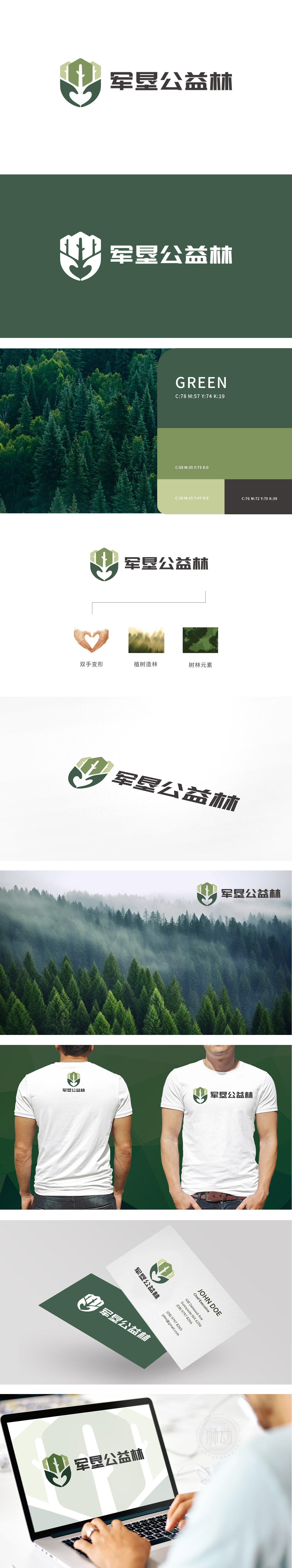
狮动设计以绿色轮廓是手托举/环绕的变形为基底,线条柔和且富有张力,既象征“人类对生态的守护”,也隐含“集体参与”的意味——公益林的建设需要大家共同托举。同时,双手的曲线自然过渡为“树的根茎”,将“人的行动”与“树的生长”直接关联,强化“植树造林”的行动属性。树形结构(核心):既模拟了树木从嫩芽到成林的生长过程,也传递“生机、活力、可持续”的生态主题。整体设计用”双手的“温度感”、树形的“生长感”、心形的“柔软感”,三者结合让logo既有“公益的温暖”,也有“行动的力量”,让整个logo看起来更有情感深度。
Lion design is based on the green outline, which is a hand-lifting/surrounding deformation. The lines are soft and full of tension, which not only symbolizes "human's protection of the ecology", but also implies the meaning of "collective participation"-the construction of public welfare forest needs everyone's joint lifting. At the same time, the curve of hands naturally transforms into "the root of the tree", which directly relates "human action" with "the growth of the tree" and strengthens the action attribute of "afforestation". Tree structure (core): It not only simulates the growth process of trees from bud to forest, but also conveys the ecological theme of "vitality, vitality and sustainability".


扫码或拨打添加客服微信


