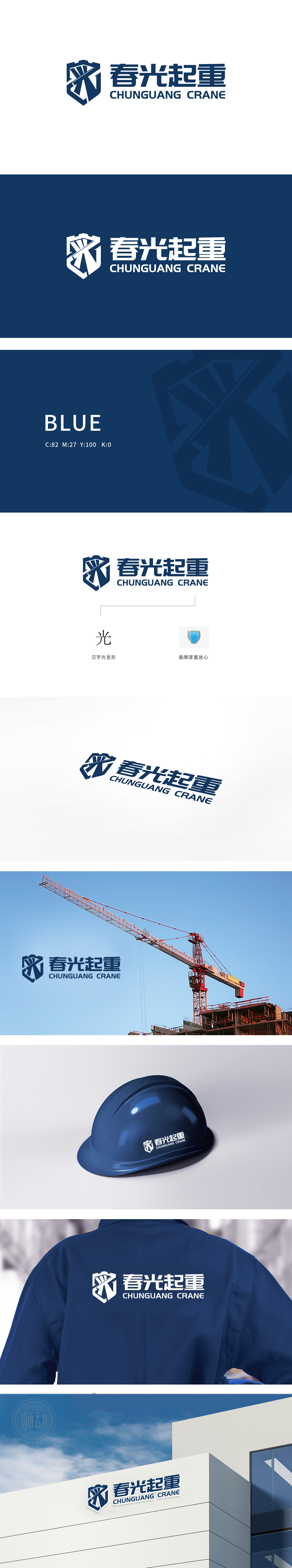
狮动设计采用盾牌图标作为视觉核心,将“春光”的“光”字与起重机的核心结构进行了创意融合:图标内部的斜线与交叉线:模仿了起重机“起重臂”“吊钩”或“金属支架”的结构,直接关联“起重”行业的核心产品特征;变形的“光”字:通过笔画的简化与几何化处理,将“光”字的“撇、横、竖钩”转化为起重机的“机械臂”形态,既保留了品牌名称“春光”中的“光”字识别性,又将行业属性隐于文字变形之中,实现了“名称-图形-行业”的三重关联;将“功能性”与“艺术性”达到平衡,最终实现了“看图形知行业,看文字知品牌”的高效传播。
Lion Motion design uses the shield icon as the visual core, and creatively integrates the word "light" of "spring" with the core structure of the crane: the diagonal lines and cross lines inside the icon imitate the structure of the crane's "boom", "hook" or "metal bracket" and directly relate to the core product characteristics of the "lifting" industry; Distorted "light" character: Through the simplification and geometric treatment of strokes, the "left hook, horizontal hook and vertical hook" of the word "light" is transformed into the "mechanical arm" shape of the crane.


扫码或拨打添加客服微信


