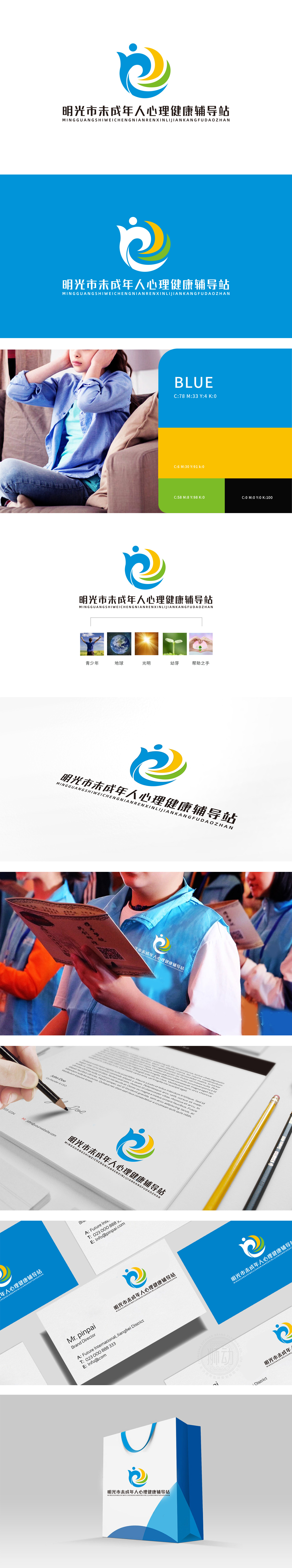
狮动设计用形状和颜色讲“故事”,主体是蓝、黄、绿三色交织的波浪形,像一只张开的手臂,又像一个蹦跳的孩子,蓝色:像一片温柔的海,代表信任与稳定,黄色:像一缕阳光,象征活力与希望,贴合青少年的朝气;绿色:像刚冒头的嫩芽,代表成长与治愈,整体形状既有“人”的温度,又有“流动”的感觉,仿佛在说:“来,我们一起慢慢变好~” 整体设计好看又“有温度”,把抽象的“爱与陪伴”变成了看得见、能共情的视觉语言。
Lion design tells a story with shapes and colors. The main body is blue, yellow and green interwoven waves, like an open arm and a jumping child. Blue: like a gentle sea, representing trust and stability, yellow: like a ray of sunshine, symbolizing vitality and hope, fitting the youthful spirit; Green: like a budding bud, it represents growth and healing. The overall shape has both the temperature of "human" and the feeling of "flowing", as if to say: "Come, let's get better together ~" The overall design is beautiful and "warm", which turns the abstract "love and companionship" into a visual language that can be seen and empathetic.


扫码或拨打添加客服微信


