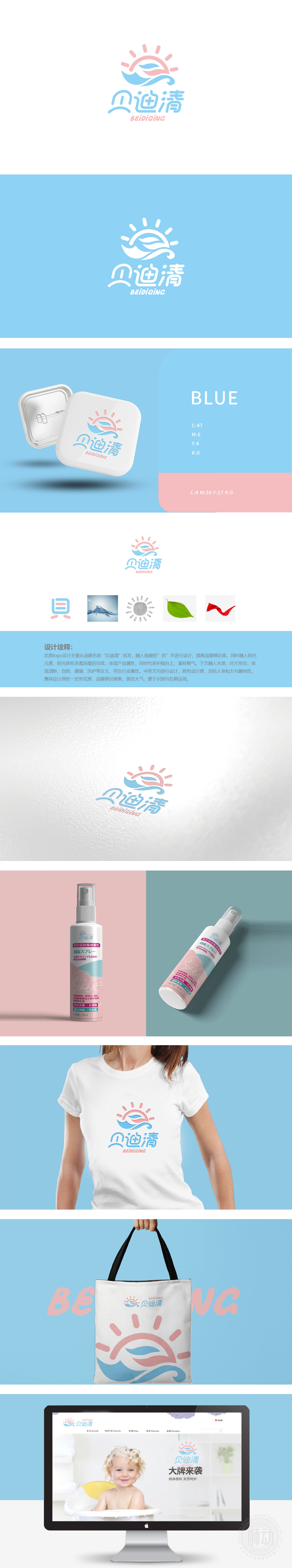
狮动设计采用“从名称到符号的转化”,通过抽象化的图形将品牌名称与内涵可视化,既保留辨识度,又赋予设计感::以品牌名称的核心字“贝”为视觉原点,将其简化为上下结构的图形,形成了独特的品牌符号。阳光的“杀菌消毒”属性直接对应日化清洁产品的核心功能,同时用“阳光”的积极意象传递品牌“向上、朝气”的形象,让消费者从视觉上感受到产品的可靠性与品牌的正能量。水波与叶片的行业贴合:则精准对接日化行业的“清新、自然、健康”基调:用最简洁的图形语言,传递最丰富的品牌信息:用设计回应行业需求。
Lion Design adopts "the transformation from name to symbol", visualizes the brand name and connotation through abstract graphics, which not only retains the recognition, but also gives the design sense: taking the core word "Bei" of the brand name as the visual origin, it is simplified into the upper and lower structure graphics, forming a unique brand symbol. The "sterilization" property of sunlight directly corresponds to the core function of daily chemical cleaning products, and at the same time, the positive image of "sunshine"is used to convey the image of "upward and vigorous" of the brand, so that consumers can visually feel the reliability of the product and the positive energy of the brand. The industry fit of water wave and blade.


扫码或拨打添加客服微信


