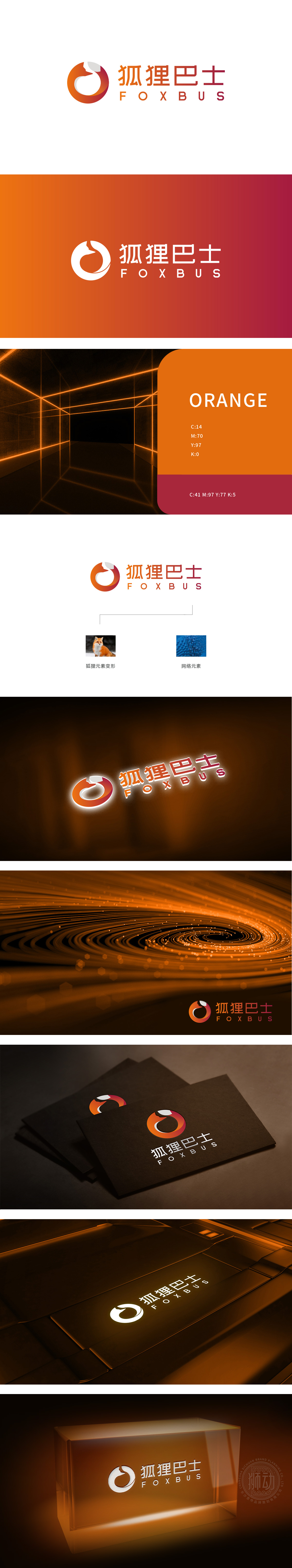
狮动设计通过抽象化处理保留了狐狸特征,同时用流畅的曲线,强化了“机敏、灵活、敏锐”的象征意义,而这些特质恰恰是科技产品最需要传递的核心价值(比如算法的精准、响应的迅速)。狐狸的颜色采用橙红渐变,既保留了狐狸本身的“活力感”,又通过渐变效果增加了“科技感”,更符合科技品牌的“轻盈”定位。整体将自然意象与科技语言的融合,每一个元素都有明确的“科技语言”表达:既用狐狸的“辨识度”解决了品牌的“记忆点”问题,又用网络的“结构感”传递了科技产品的“专业度”,像狐狸一样机敏的智能服务,像网络一样可靠的技术支撑。
Lion design retains the characteristics of fox through abstraction, and at the same time strengthens the symbolic meaning of "agility, flexibility and sensitivity" with smooth curves, which are exactly the core values that need to be conveyed by scientific and technological products (such as the accuracy of algorithms and the rapid response). The color of the fox adopts orange-red gradient, which not only retains the "sense of vitality" of the fox itself, but also increases the "sense of technology" through the gradient effect, which is more in line with the "lightness" positioning of the technology brand. As a whole, the natural image is integrated with the language of science and technology, and each element has a clear expression of "language of science and technology".


扫码或拨打添加客服微信


