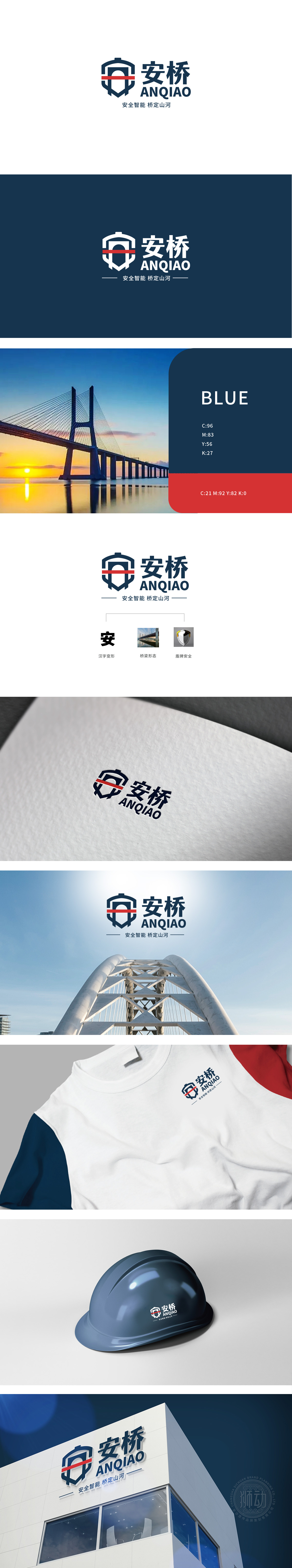
狮动设计用视觉讲品牌故事”,通过三个核心元素的叠加,将“安”(安全)、“桥”(建筑)、“盾”(防护)三个关键词转化为可感知的图形符号:盾牌+桥洞:安全与建筑的具象融合,以盾牌为基础形态(象征安全、守护),嵌套了一个圆形桥洞,又像“安全防线”般强化了“守护”的意象——这种设计将“安全”(抽象概念)与“桥梁”(具体建筑形态)进行了符号化绑定,让品牌属性一目了然。“汉字安变形”将汉字的文化内涵(“安”代表稳定、安全)与建筑的功能属性(桥梁的稳固性)进行了视觉化连接,实现了“形”(汉字)与“意”(安全、建筑)的高度统一。
Lion Design tells brand stories visually. Through the superposition of three core elements, the three key words of "safety", "bridge" (architecture) and "shield" (protection) are transformed into perceptible graphic symbols: shield+bridge opening: the concrete integration of safety and architecture, with the shield as the basic form (symbolizing safety and guarding), and a circular bridge opening is nested, which is also like. The "Chinese character security deformation" visually connects the cultural connotation of Chinese characters ("security" stands for stability and safety) with the functional attribute of buildings (stability of bridges), and realizes a high degree of unity between "shape" (Chinese characters) and "meaning" (safety and architecture).


扫码或拨打添加客服微信


