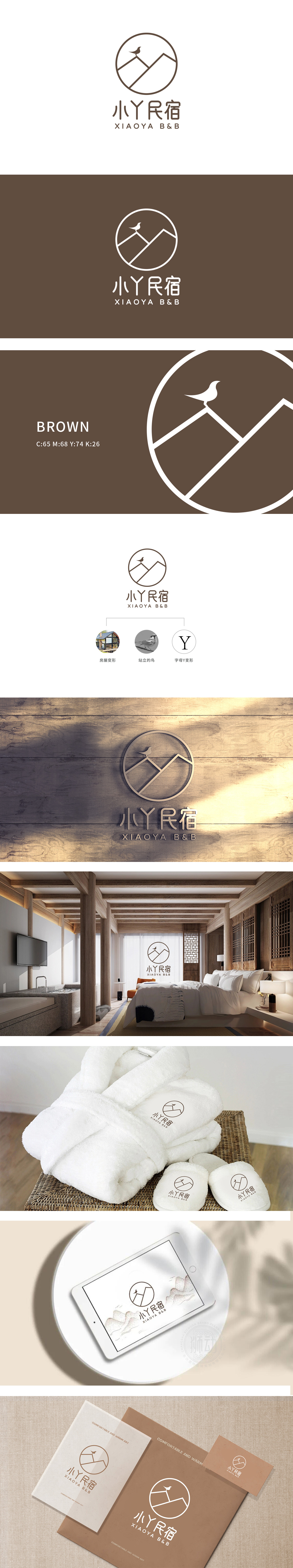
狮动设计以极简圆形为外框,恰好对应民宿“像家一样包容”的核心诉求——就联想到“温暖、放松、无距离感”的住宿体验,山峰+房屋变形=“自然与居住的融合”,用自然符号承载居住功能:既传递了“亲近自然”的民宿特色,又直接点出了“住宿”的核心功能。站立的鸟=“自然的生机与温度”,传递“自然的亲近感”:增加“沉浸式自然体验”的期待。图形里的“中式密码”:整体设计每一笔都藏着诗意,把中式民宿的“诗意”一下子撞进了人的心里。
The design of Lion Motion is framed by a minimalist circle, which just corresponds to the core appeal of "being as inclusive as home"-it is associated with the accommodation experience of "warmth, relaxation and no sense of distance", and the mountain peak+house deformation = "the integration of nature and residence", bearing the residential function with natural symbols: it not only conveys the characteristics of "being close to nature" but also directly points out the core function of "accommodation". Standing bird = "natural vitality and temperature", conveying "natural closeness": increasing the expectation of "immersive natural experience" .


扫码或拨打添加客服微信


