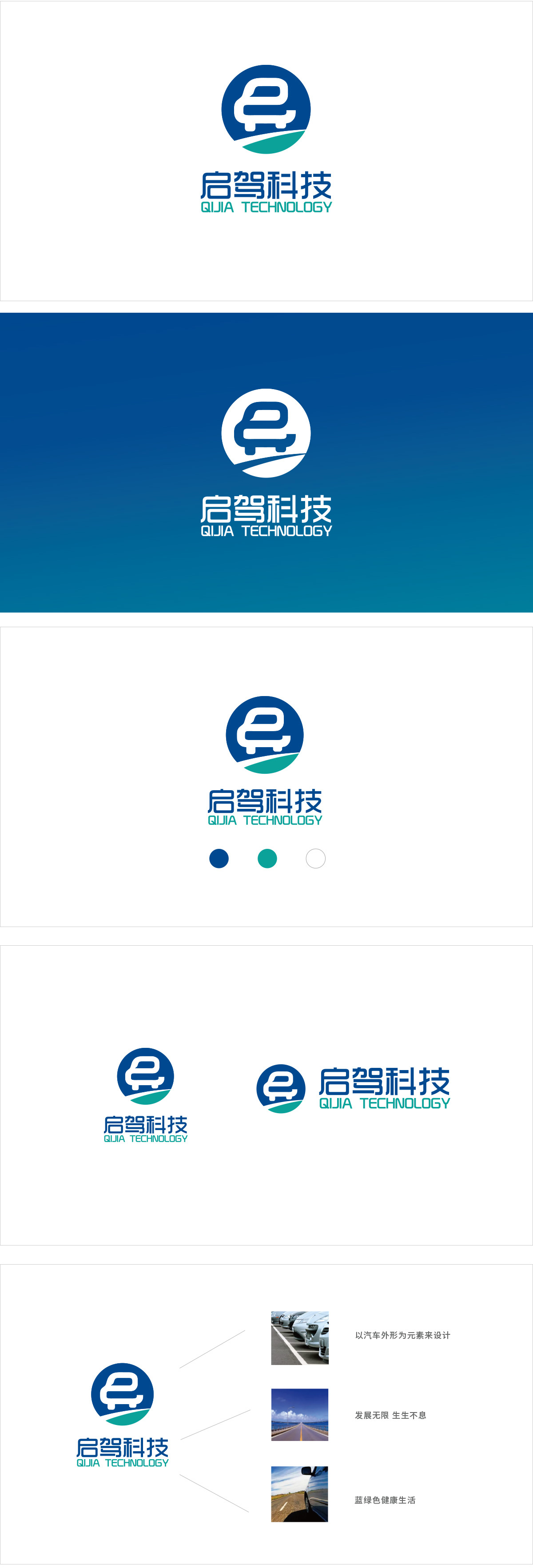
狮动设计采用「极简语言」锚定行业认知,视觉中心是简化的汽车轮廓,只用抽象的「车头+车身+车轮」结构,甚至连车窗都简化成了一个小弧度,但依然能瞬间让人联想到「汽车」。这种「少即是多」的处理,既符合科技品牌的「简洁感」,又能在短时间内传递核心业务(汽车相关),非常高效。汽车图标被放在圆形框架里——圆形自带「循环、永恒、凝聚力」的心理暗示;「启驾科技」,线条平直、边角圆润,既有科技品牌的「现代感」,又不失亲和力。
Lion design uses "minimalist language" to anchor industry cognition, and the visual center is a simplified car outline. Only the abstract structure of "head+body+wheels" is used, and even the window is simplified into a small arc, but it can still remind people of "car" instantly. This "less is more" processing not only conforms to the "simplicity" of technology brands, but also can deliver core business (automobile-related) in a short time, which is very efficient.


扫码或拨打添加客服微信


