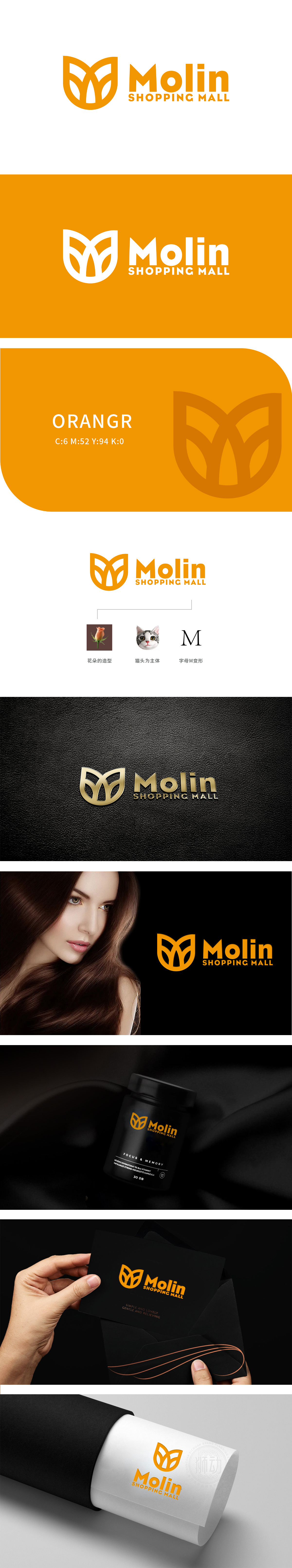
狮动设计以花瓣形态(自然元素),体现“植物成分”“芬芳气味”“温和无刺激”,传递“源于自然的安全与舒适”,花瓣内部的结构,巧妙勾勒出猫脸的轮廓,猫是日化品的“流量密码”——其“软萌、温顺、亲近”的形象,猫的“娇憨”能引发“被宠爱”的情绪;让logo从“冰冷的符号”变成了“有温度的伙伴”,大幅提升了品牌的亲近感。通过“花朵+猫头”的包裹,让“M”从“字母”变成了“故事载体”,传递自然、亲和的日常,为品牌打造了一个“能说话的视觉代言人。
Lion design takes petal shape (natural elements), which embodies "plant composition", "fragrant smell" and "mild and non-irritating", and conveys "safety and comfort from nature". The internal structure of the petals cleverly outlines the outline of the cat's face. The cat is the "flow code" of daily chemicals-its "soft, gentle and close" image, and the cat's "finals" can be triggered. Let the logo change from a "cold symbol" to a "partner with temperature", which greatly enhances the brand's closeness.


扫码或拨打添加客服微信


