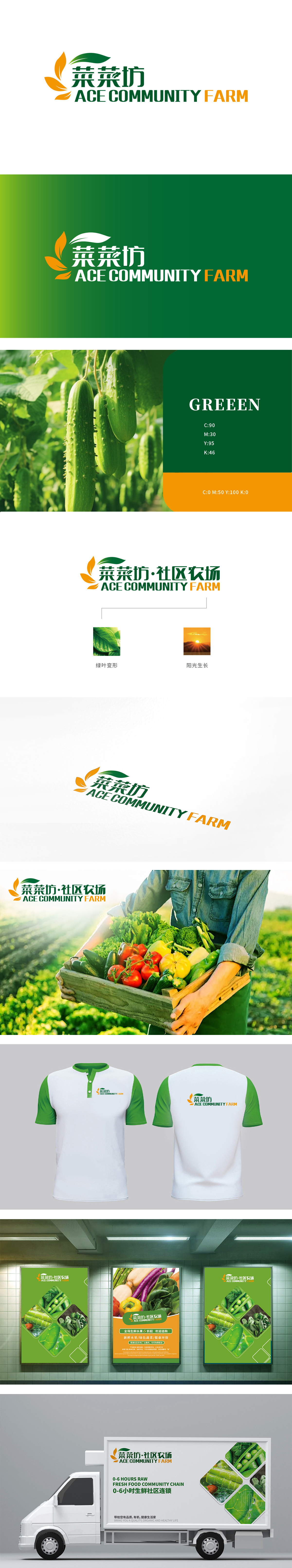
狮动设计logo以“绿叶”为原型,将叶片简化为舒展的“五瓣形态”边缘微微翘起,像刚从菜地里拔出来的青菜,带着晨露的鲜活感;颜色选择:采用“深绿+浅绿”的渐变绿,视觉上直接传递“新鲜、嫩脆”的生鲜属性。让用户看到图形就联想到“刚从农场摘的青菜”,精准对接“社区农场”的“直供新鲜”定位。整体用“自然符号”翻译“生鲜价值”——将“新鲜”“阳光农场”这些用户熟悉的自然元素,简化为可视觉化的图形,通过“形态、颜色、组合”的设计,精准传递“社区里的新鲜农场菜”的品牌定位。
Lion esign logo takes "green leaves" as the prototype, simplifying the leaves into a stretched "five-petal shape" with slightly tilted edges, like vegetables just pulled out of vegetable fields, with a fresh sense of morning dew; Color selection: adopt "dark green+light green" gradient green, which directly conveys the fresh attribute of "fresh, tender and crisp" visually. Let users think of "vegetables just picked from the farm" when they see the graphics, and accurately dock the "direct supply for fresh" positioning of "community farms".


扫码或拨打添加客服微信


